

Here’s what happened
I was originally tinkering with a CDN recently. The plan was simple: first run the data without a CDN using the old theme, then enable the CDN for comparison to see how much faster it would be.
Everything was going according to plan until I looked down at the theme I was using—the free version of Hueman.
I’ve used this theme for quite a while. It’s not particularly great, but it hasn’t caused any major issues. The only thing that slightly bothered me was its maximum screen width of 1680px. A few years ago, this wasn’t an issue at all, but lately, I’ve felt something was off. I couldn’t quite put my finger on it, but the page just felt empty on both sides, especially when viewed on a large screen.
So I started hesitating: Should I take advantage of this CDN tinkering to change the theme as well?
On one hand, changing themes is a significant project. If the new theme has all sorts of compatibility issues or ends up being slower, I’d just be asking for trouble. On the other hand, if my readers’ screens had long surpassed 1680px, was it really justifiable to keep restricting them with this limit?
After agonizing over this for a few days, I decided not to rely on gut feeling and to look at the data instead.
Digging through the data felt like opening a blind box
I opened Google Analytics (GA4), navigated to “Tech” → “Tech Details,” and exported the data for the past 30 days, measured by “active users.”
To be honest, I had no idea what to expect before clicking. If the data showed that most users were still using older 1366×768 screens, then my hesitation would have been much ado about nothing, and I could have just peacefully continued using the old theme.
When I saw the first set of data, I was taken aback.
Screen resolution: worse than I thought
| Rank | Screen Resolution | Active Users | Percentage | Exceeds 1680px |
|---|---|---|---|---|
| 1 | 1280×1200 | 36,148 | 56.37% | ❌ |
| 2 | 1920×1080 | 22,482 | 35.06% | ✅ |
| 3 | 800×600 | 1,256 | 1.96% | ❌ |
| 4 | 393×851 (Mobile) | 768 | 1.20% | ❌ |
| 5 | 2560×1440 | 404 | 0.63% | ✅ |
| 6 | 1536×864 | 212 | 0.33% | ❌ |
| 7 | 1366×1366 | 154 | 0.24% | ❌ |
| 8 | 1440×3000 | 127 | 0.20% | ❌ |
| 9 | 2048×1152 | 117 | 0.18% | ✅ |
| 10 | 1707×1067 | 116 | 0.18% | ✅ |
After calculating carefully, active users with a screen width exceeding 1680px accounted for a combined total of over 35%.
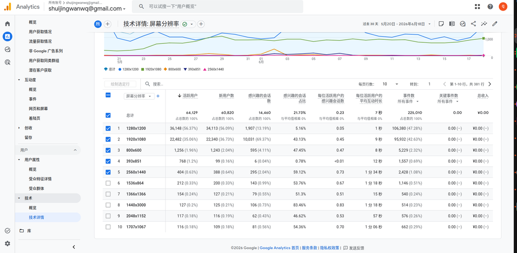
One out of every three visitors sees blank space on both sides under my current theme.
This proportion is much higher than I expected. Although 1280×1200 is the primary resolution (56.37%), 1920×1080 follows closely at 35.06%. When you add in users with even higher resolutions like 2560×1440, 2048×1152, and 1707×1067, they already form a massive group.
And such trends only go up, not down.
Seeing this data, the balance in my mind had already started to tip.
Device category: 96% are desktop users, completely overturning my assumptions
Then I looked at the second set of data—device category.
| Device Category | Active Users | Percentage |
|---|---|---|
| Desktop | 61,796 | 96.36% |
| Mobile | 2,210 | 3.45% |
| Tablet | 31 | 0.05% |
| Smart TV | 3 | <0.01% |
96.36% of active users are on desktop devices.
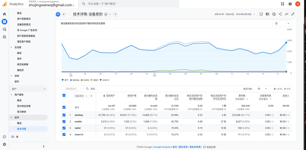
To be honest, this data surprised me a bit. I always thought mobile traffic would be at least 15%-20%, but it turned out to be only 3.45%.
This means two things:
- The vast majority of my readers read the blog on a computer. Widescreen adaptation isn’t just a nice-to-have; it’s a necessity.
- Although mobile users make up a small percentage, those 2,210 active users are real people. The new theme must at least be usable on mobile.
Browsers: 96% use Chrome, which was a relief
Next, I looked at the browser distribution:
| Browser | Active Users | Percentage |
|---|---|---|
| Chrome | 61,561 | 96.00% |
| Edge | 1,191 | 1.86% |
| Android Webview | 619 | 0.97% |
| Firefox | 336 | 0.52% |
| Safari | 326 | 0.51% |
| Safari (in-app) | 82 | 0.13% |
Chrome accounts for 96%.
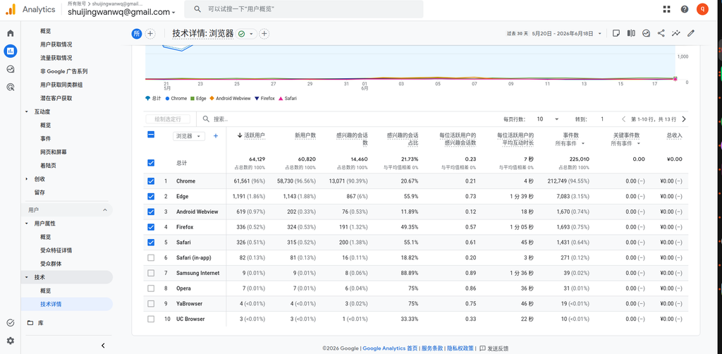
Seeing this data, I breathed a sigh of relief.
The most headache-inducing part of changing themes is compatibility. If the layout broke in Safari or crashed in Firefox, how much time would I have to spend fixing it? As it turns out, almost all my readers use Chrome, which means I can drastically narrow down my testing scope, and the risk is much lower.
Honestly, this data was a major driving force that pushed me from “hesitating” to “deciding to switch.”
Operating system: Windows accounts for over 93%
Finally, I took a look at the operating system versions:
| Operating System | Active Users | Percentage |
|---|---|---|
| Windows 10 | 37,230 | 58.05% |
| Windows 11 | 22,746 | 35.47% |
| Macintosh Intel 10.15 | 993 | 1.55% |
| Android 12 | 486 | 0.76% |
| Android 9 | 276 | 0.43% |
| Android 11.0 | 254 | 0.40% |
Windows 10 + Windows 11 combined account for 93.52%.
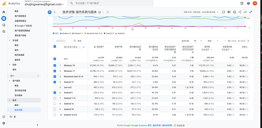
The user persona was now very clear: desktop, Windows, Chrome browser, 1920×1080 or higher resolution—this is what the vast majority of my readers look like.
Looking at these four sets of data together, I reached a reassuring conclusion:
| Dimension | Conclusion |
|---|---|
| Screen resolution | 35%+ active users have a width > 1680px, resulting in a compromised experience |
| Device category | 96.36% desktop, widescreen adaptation is a necessity |
| Browser | 96% Chrome, extremely low compatibility risk |
| Operating system | 93.52% Windows, highly concentrated testing scope |
So my decision is: switch
After agonizing over it for a few days, I finally decided to switch.
It’s not because Hueman is bad to use, nor because 1680px is completely unusable, but because the data told me that my readers are already using larger screens, while my theme is still restricting them with an outdated width limit.
The data clarified one thing for me: while this decision seemed to be about “whether to change the theme,” its essence was actually whether to continue serving my past habits or to serve the actual current state of my readers. The answer is now obvious.
After deciding to switch, a new question immediately popped up: Which should I do first, changing the theme or enabling the CDN? If the order is wrong, not only will the speed test data become a mess, but it could also trigger a caching disaster. I’ll save the details of this dilemma for the next article.
In the next post, I’ll talk in detail about the decision-making process of “whether to change the theme first or enable the CDN first,” and why the wrong order brings a lot of trouble. If you’re interested, stay tuned.
Some reflections
To be honest, the process of making this decision gave me a lot of food for thought. Often, when we hesitate about whether to do something, it’s simply because we lack information. Once you lay the data out and see it clearly, the answer usually surfaces on its own.
If you’re also struggling with whether to change your theme or modify a certain feature, you might want to dig into your own data. Don’t guess; go look it up. Data won’t make the decision for you, but it will help you see the situation clearly.