WordPress Hueman: Enable immersive reading to improve text readability and visual experience
1. After building a blog for a long time with Hueman theme, I found a pain point that affects the reader’s experience: as shown in Figure 1
The sidebars on both sides of the default layout occupy more than 1/3 of the width of the screen, and the real text content area is very narrow:
The widescreen monitor is blank, and the content is cramped and depressed;
The number of articles is squeezed more, and the reading line is beating back and forth, and the fatigue is strong;
Long-term technical texts (PHP, MySQL, TiDB architecture dry goods, ES in-depth analysis) have many codes and long paragraphs, and the narrow screen reading is very easy to be distracted;
The original thousand dry goods content, but due to the width of the layout, the overall professional texture and stay time are lowered.
2. Hueman’s native short board description
The theme defaults to the dual-column structure, and the PC side forces the body to shrink the width of the subject;
Only the width of the back-end-adjusting container is not cured, and the sidebar still occupies a seat;
There is no official ‘reading mode/full-screen focus mode’ switch;
Manually changing CSS is easy to fail the upgrade, the layout is chaotic, and the friendliness for non-front-end is low.
3. Do not modify the theme code or change the underlying layout, only use a minimalist plug-in, and one-click to realize ‘Hide Sidebar + Full Screen Widescreen + Eye Protection Pure Immersive Reading’, which is the most cost-effective and most stable optimization solution. However, in the end, I found that there are no plugins that meet the needs.
4. Finally, decide to do it manually. Background search: Simple Custom CSS and JS, install and enable. Backstage: Custom CSS & JS
Add CSS (put header, specification)
Click Add Custom CSS
Title: Read Mode Style
Location: Header (default)
Paste the following code: as shown in Figure 2
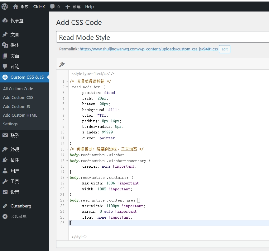
/* 沉浸式阅读按钮 */
.read-mode-btn {
    position: fixed;
    right: 20px;
    bottom: 20px;
    background: #111;
    color: #fff;
    padding: 8px 16px;
    border-radius: 5px;
    z-index: 99999;
    cursor: pointer;
}
/* 阅读模式:隐藏侧边栏、正文加宽 */
body.read-active .sidebar,
body.read-active .sidebar-secondary {
    display: none !important;
}
body.read-active .container {
    max-width: 100% !important;
    width: 100% !important;
}
body.read-active .content-area {
    max-width: 1100px !important;
    margin: 0 auto !important;
    float: none !important;
}
5. Add js (put footer, do not block rendering)
Click Add Custom JS
Title: Read Mode Toggle
Location: footer (key: footer)
Paste the following code: as shown in Figure 3
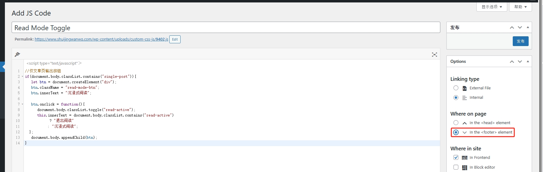
//仅文章页输出按钮
if(document.body.classList.contains("single-post")){
  let btn = document.createElement("div");
  btn.className = "read-mode-btn";
  btn.innerText = "沉浸式阅读";

  btn.onclick = function(){
    document.body.classList.toggle("read-active");
    this.innerText = document.body.classList.contains("read-active")
        ? "退出阅读"
        : "沉浸式阅读";
  };
  document.body.appendChild(btn);
}
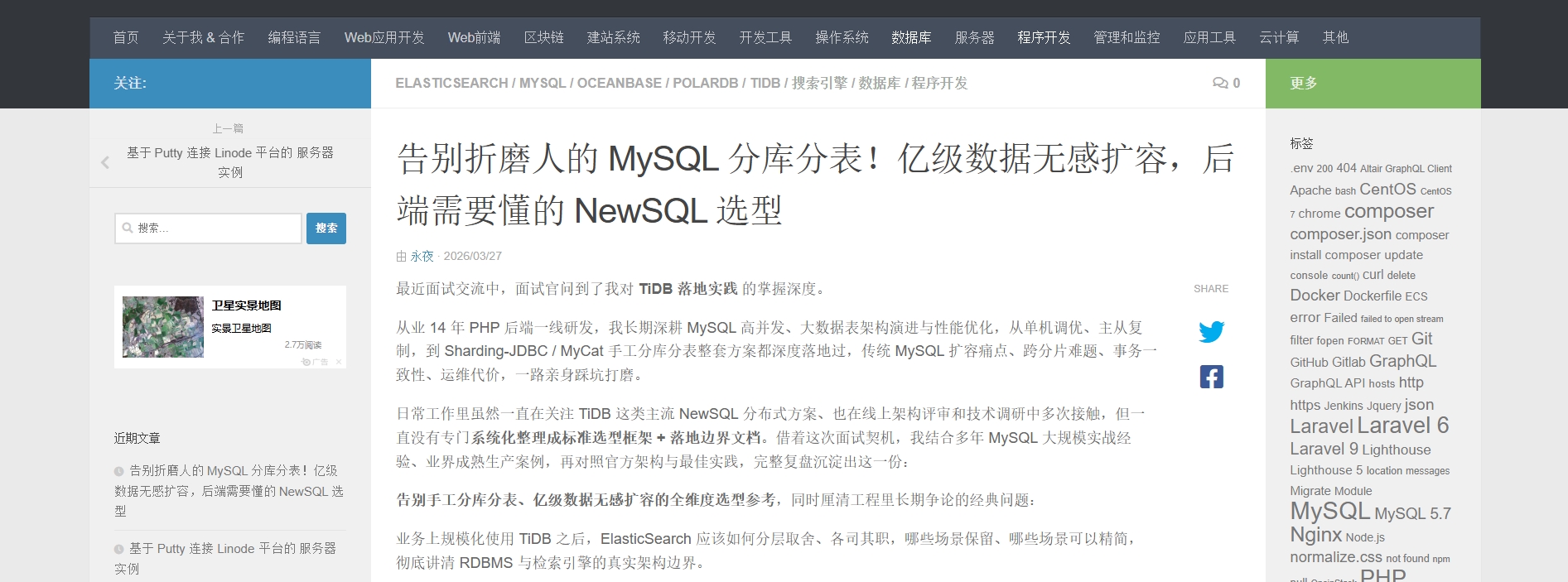
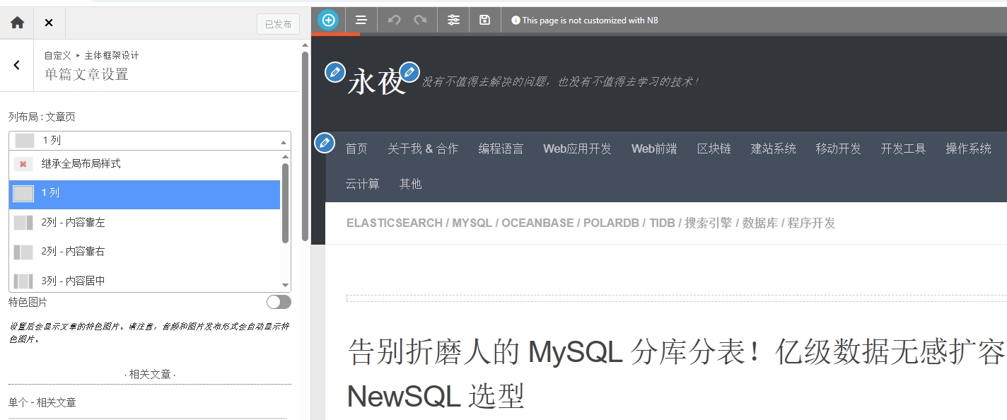
6. After clicking the immersive reading button, the left and right sides are changed to blank. However, the width of the text of the article has not changed. In the end, I gave up a plan that let users choose whether to immersive. But the default is that the content occupies the entire width. Customization – Main Framework Design – Single Article Settings – Column Layout: Article Page – Select 1 column and publish. as shown in Figure 4
7. The final effect is in line with expectations. The content of the blog content occupies the entire width of the website page. Improved reading experience. as shown in Figure 5