From the bottom of the menu to the top bar in the upper right corner, a tossing record of a block theme layout
Recently I switched the website theme from Hueman to WordPress official 2025 themes(Twenty Twenty-Five), which is a block-based modern theme. The website needs to support Chinese and English bilingual, the use is polylang plugin + TMS extensions for polylang Enhancement package.
After the theme switch, I encountered a seemingly simple but tossed problem for a long time:
The language switcher appears at the bottom of the menu by default, and I want to put it in the upper right corner of the page.
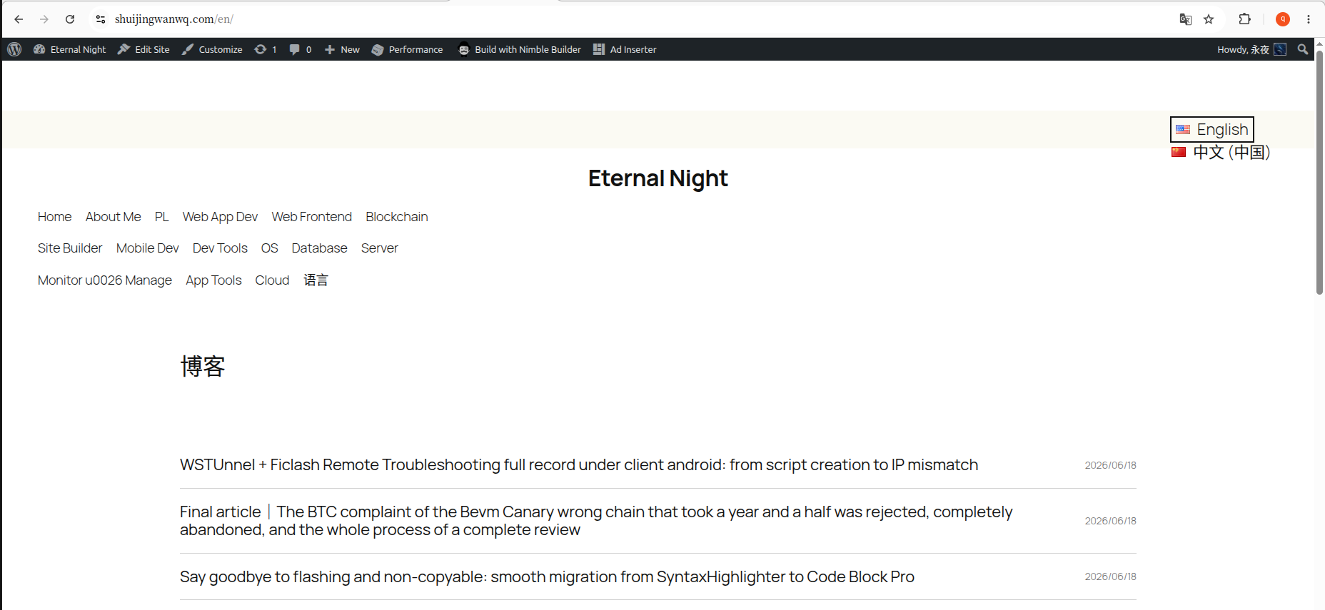
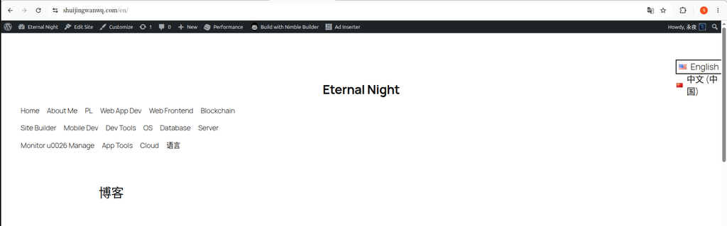
Figure 1 is the language switcher added at the end of the menu when the old theme is old. After changing to a new theme, the default effect is still the language switch in the menu. (See Figure 1)
This article records the whole process from a foggy to the final solution.
1. Why is the position of the language switcher important?
Before starting to talk about the operation, let me briefly talk about why I insist on adjusting this position.
The UX study of Nielsen Norman Group pointed out that,Language switcher is a ‘primary requirement’ for non-native users, not ‘secondary options’. Putting it at the bottom of the page or deep in the menu will directly increase the user’s bounce rate.
The practice of most international websites is to putUpper right corner of the page, the user has formed this usage habit.
2. My environment
| Project | version/name |
|---|---|
| WordPress Topics | Twenty Twenty-Five (2025 theme, block theme) |
| multilingual plugin | polylang |
| Enhancement plugin | TMS extensions for polylang |
| language switcher | ‘Language Switcher Advanced’ block for TMS |
Note: Polylang comes with a language switcher, and TMS Extensions provides an enhanced section ‘Language Switcher Advanced’, which is added in a similar way.
3. Trialed plans (detours record)
Option 1: Add through ‘Appearance → Menu’
This is the most frequently recommended method in many tutorials: enter Appearance → Menu, check the ‘Language Switch’ in ‘Display Options’, and then add it to the menu.
Problem: 2025 The theme isBlock theme, under the ‘Appearance’ menu, you can’t find the traditional ‘menu’ editing interface at all – that is only available in classic themes.
Scenario 2: Use the ‘Gap’ area
In Appearance → Gadgets , found the ‘Polylang language switcher’ gadget, drag and drop to the top gadget area.
Problem: There is no gadget area reserved at the top of the page, and the language switcher cannot appear where I want.
Option 3: Add blocks directly to the header
I entered the site editor and added directly to the header template Language Switcher Advanced block, and then try to make it ‘right-aligned’.
Problem: Although the block is indeed in the header area, its width is limited by the parent container, and the entire row block only accounts for about 2/3 of the page width. After setting ‘Right Align’, the language switch just ran to the right side of the container, not the rightmost of the page.
The final solution (step by step)
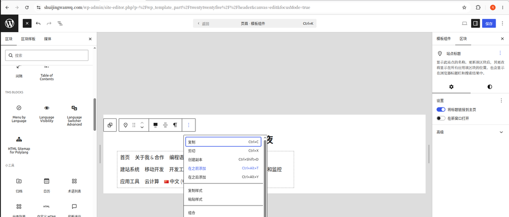
Step 1: Enter the Site Editor
From the WordPress background, click Appearance → Editor, in the context menu of the site title block, select ‘Add before’. (See Figure 2)
Step 2: Add a ‘line’ block
In the header template, find where you want to place the language switcher, add a ‘line’ block(row). (See Figure 3)
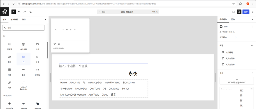
Why use the ‘line’ block instead of directly adding the language switcher? Because the ‘line’ block is a container, you can control the overall alignment of everything inside. If you add a language switch alone, it is difficult to precisely control its position.
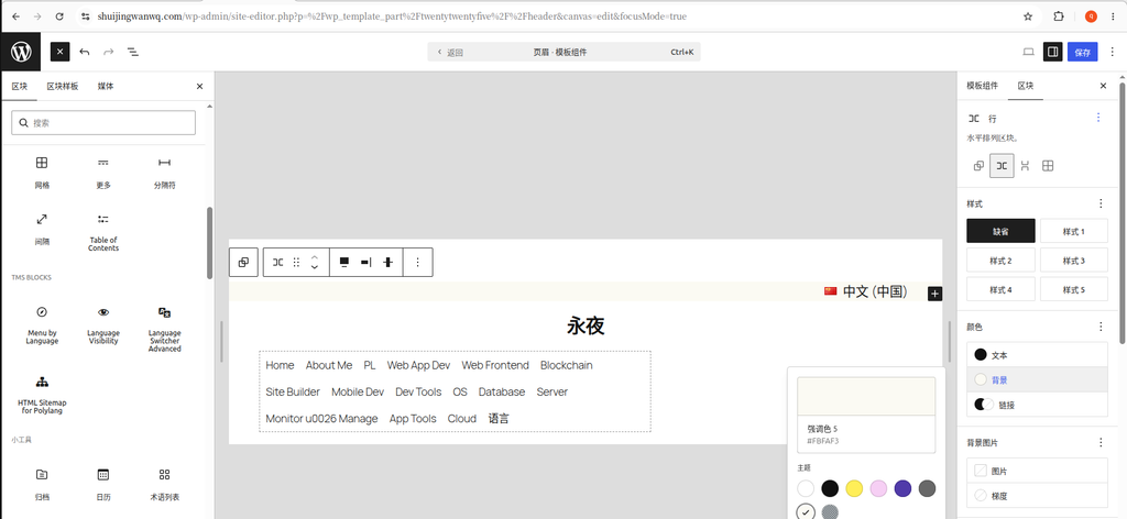
Step 3: Put the language switcher into the line block and set the layout
Add inside the line block ‘Language Switcher Advanced’ block, then select the row block, in the layout settings:
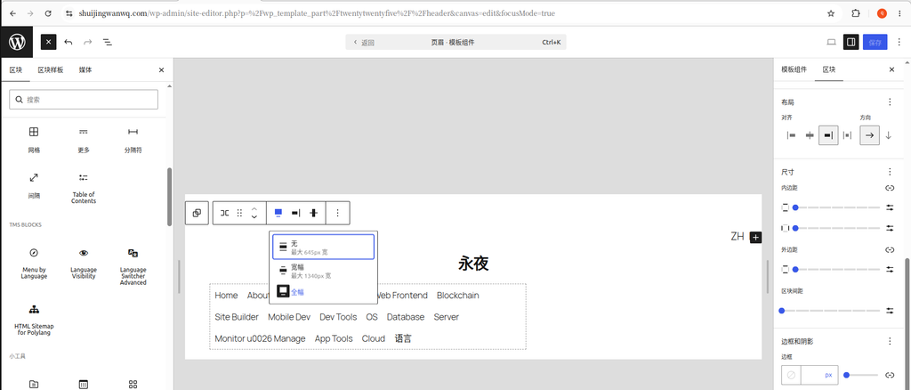
- set width to ‘full frame’(full width)
- Set horizontal alignment to ‘Right-Aligned Top’(See Figure 4)
Step 4: Adjust the wrapping problem of the language switch drop-down list
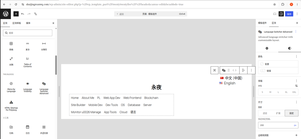
After setting, open /en In the English page, click ‘English’ and find that the ‘Chinese (China)’ in the drop-down list is displayed, which does not meet the expectations. (See Figure 5)
Solution: Select the language switcher block, in the size setting, set the width to Fixed 200px. (See Figure 6)
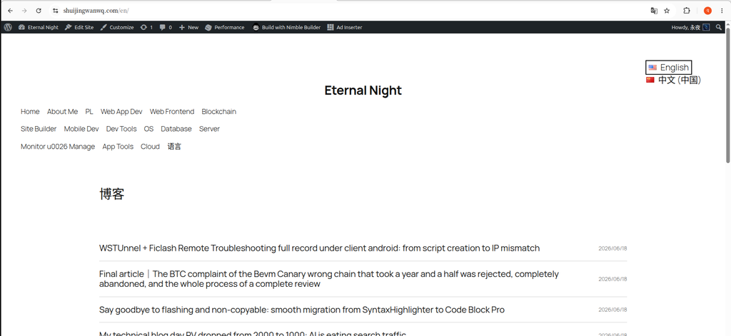
Open again /en Click ‘English’ on the page, and the ‘Chinese (China)’ line in the drop-down list is displayed, which is in line with expectations. (See Figure 7)
Step 5: (Optional) Add a background color to make the top bar more obvious
In order to make the language switcher visually independent, I added a light background color to it.
Operation path: Select the row block → right panel → ‘Color’ → ‘Background’, and select a color from the default theme color. (See Figure 8)
A small episode: The theme color scheme presets only 8 colors, no light gray. I chose a pale pink
#ffbaf3, the effect is unexpectedly good – gentle, not eye-catching, and can clearly distinguish the top bar area.
At the same time, in the ‘Size’ setting, add some to the upper and lower row blocks Bottoms(Padding, such as 8-12px), make the top bar not so crowded.
Step 6: Save and clear the cache
Click on the upper right corner ‘save’ button.
If there is a cache plugin (such as W3 Total Cache), remember to clear all caches, and then refresh the foreground page to view the effect.
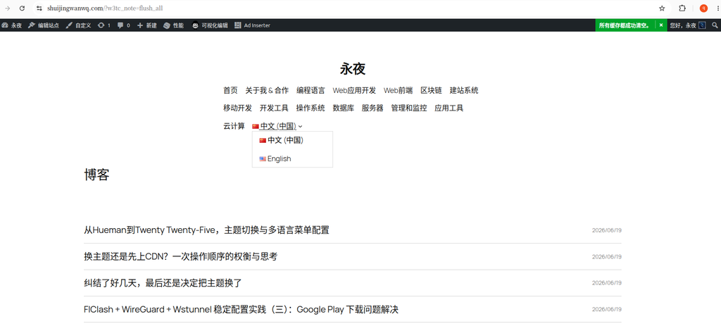
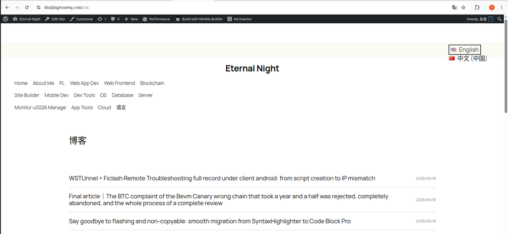
The final effect
After the above steps, the final effect of the language switch on the page is as expected. (See Figure 9)
6. Summary of stepping on the pit
| Problem | Reason | Solution |
|---|---|---|
| Can’t find the “menu” interface | 2025 is a block theme, no traditional menu | Use Site Editor |
| Line block width is only 2/3 | Default width is limited by parent container | Set the row block to ‘full frame’ |
| The language switcher position is wrong | Alignment is not set correctly | Select ‘Right-Aligned Top’ |
| Drop-down list line break display | Insufficient block width | The fixed width is set to 200px |
| Color selection is limited | The theme presets 8 colors | Choose the right color from the theme color |
7. Summary of technical points
Through this toss, I have summarized a few points about the layout of the block theme:
1. Understand the role of ‘line’ blocks
Row block (row) The internal elements are arranged horizontally, which is suitable for horizontal layout such as top bars and navigation. This time the requirement is ‘horizontal arrangement + right alignment’, so the ‘line’ block is the right choice.
2. ‘Full Frame’ is the key to breaking the parental restriction
In the block theme, each block inherits the width of the parent container by default. To have a block full of screen width, it must be explicitly set to ‘full frame’.
3. Solve the drop-down list line break problem
The display width of the drop-down list of the language switcher is affected by the width of the block. If there is a newline, it can be solved by a fixed width.
4. Three ways to add the Polylang language switch
| Manner | Applicable scenarios |
|---|---|
| Independent “line” block + language switch | Need to be precisely positioned in the top bar (used in this article) |
| Put in the navigation menu | The switcher appears in the navigation bar as a menu item |
Trace [polylang_language_switcher] | Wherever it is, the most compatible |
5. Selection of Polylang vs TMS Extensions
| Scenes | Recommend |
|---|---|
| Just need the basic switching function | Polylang’s own language switcher |
| Requires more style customization | ‘Language Switcher Advanced’ for TMS |
| Different menus need to be configured for different languages | ‘Menu by Language’ for TMS |
My approach is to use the ‘Language Switcher Advanced’ block of TMS to implement the switch, and at the same time use the ‘Menu by Language’ function to create different menu structures for both Chinese and English.
8. Postscript
If you are also using WordPress block theme + Polylang, I hope this article will save some time. Although it’s just a small switch, the tossing has given me a deeper understanding of the layout logic of the block theme.
Leave a Reply