
Things are like this
Recently, I was tossing about CDN, and the plan is very simple: first use the old theme to run the data of ‘No CDN’, and then turn on the CDN for comparison, and see how much faster it can be.
Everything went as planned, until I looked down at the theme I used – Hueman Free Edition.
I have been using this topic for a long time, and I can’t say how good it is, but there has been no major problem. The only thing that makes me a little bit is that its maximum screen width is only 1680px. In the past few years, this was not a problem at all, but recently I always feel that something is wrong – I can’t say it, I just feel that the sides of the page are empty, especially when I use a large screen to see it.
So I started to struggle:Do you want to take advantage of this tossing on the CDN and change the theme together?
On the one hand, changing the theme is not a small project. If the new theme is incompatible and the speed is slower, then I really ask for trouble. On the other hand, if my reader’s screen has already exceeded 1680px, I will continue to use this restriction to frame people, isn’t it a bit unreasonable?
After struggling for a few days, I decided not to make judgments based on my feelings, but to look through the data.
The process of turning data is like opening a blind box
I opened Google Analytics (GA4), went to ‘Technology’ → ‘Technical Details’, and exported the data of the past 30 days with ‘active users’ as the caliber.
To be honest, I didn’t know what to do before I opened it. If the data shows that most users are still using the old screen of 1366×768, then my entanglement is to ask for trouble, and it is enough to use the old theme directly with peace of mind.
When I saw the first set of data, I was stunned for a moment.
Screen resolution: more serious than I thought
| Rank | Screen Resolution | Number of active users | proportion | Is it more than 1680px |
|---|---|---|---|---|
| 1 | 1280×1200 | 36,148 | 56.37% | ❌ |
| 2 | 1920×1080 | 22,482 | 35.06% | ✅ |
| 3 | 800×600 | 1,256 | 1.96% | ❌ |
| 4 | 393×851 (mobile phone) | 768 | 1.20% | ❌ |
| 5 | 2560×1440 | 404 | 0.63% | ✅ |
| 6 | 1536×864 | 212 | 0.33% | ❌ |
| 7 | 1366×1366 | 154 | 0.24% | ❌ |
| 8 | 1440×3000 | 127 | 0.20% | ❌ |
| 9 | 2048×1152 | 117 | 0.18% | ✅ |
| 10 | 1707×1067 | 116 | 0.18% | ✅ |
After careful calculation, active users with a screen width of more than 1680px, the total proportion more than 35%.
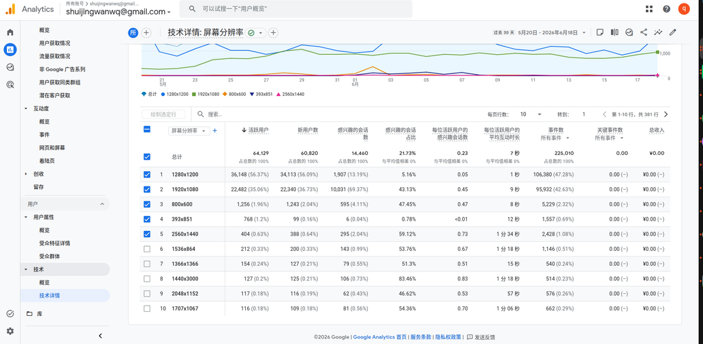
One out of every three visitors, and there are blank spaces on both sides under my current theme.
This ratio is much higher than I thought. 1280×1200 is the main force (56.37%), but 1920×1080 is closely followed by 35.06%, plus 2560×1440, 2048×1152, 1707×1067 These higher resolution users add up to a huge group.
And this kind of thing will only rise and not go backwards.
When I saw this set of data, my inner balance was already a little tilted.
Equipment category: 96% are desktops, directly subverting my cognition
Then I looked at the second set of data – the device category.
| Device Category | Number of active users | proportion |
|---|---|---|
| Desktop (Desktop) | 61,796 | 96.36% |
| Mobile Devices (Mobile) | 2,210 | 3.45% |
| Tablet | 31 | 0.05% |
| Smart TV (Smart TV) | 3 | <0.01% |
96.36% of active users use desktop devices.
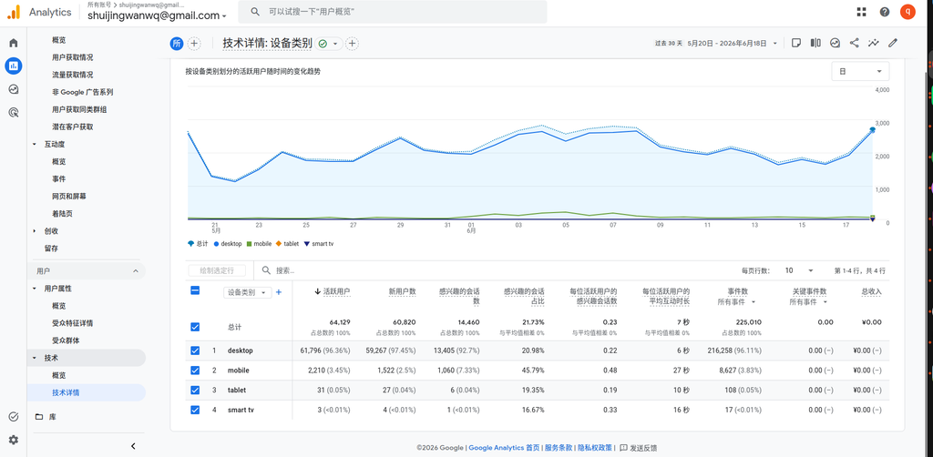
To be honest, this data surprised me a bit. I have always thought that the mobile terminal has to have a 15%-20% of the ratio, and the result is only 3.45%.
This means two things:
- The vast majority of my readers read blogs on the computer, and the widescreen adaptation is not the icing on the cake, it is just needed.
- Although the proportion of the mobile terminal is not high, 2,210 active users are also real people, and the new theme must be at least ‘usable’.
Browser: 96% are chrome, I’m relieved
Next, look at the browser distribution:
| browser | Number of active users | proportion |
|---|---|---|
| chrome | 61,561 | 96.00% |
| Edge | 1,191 | 1.86% |
| android webview | 619 | 0.97% |
| firefox | 336 | 0.52% |
| safari | 326 | 0.51% |
| Safari (in-app) | 82 | 0.13% |
Chrome accounts for 96%.
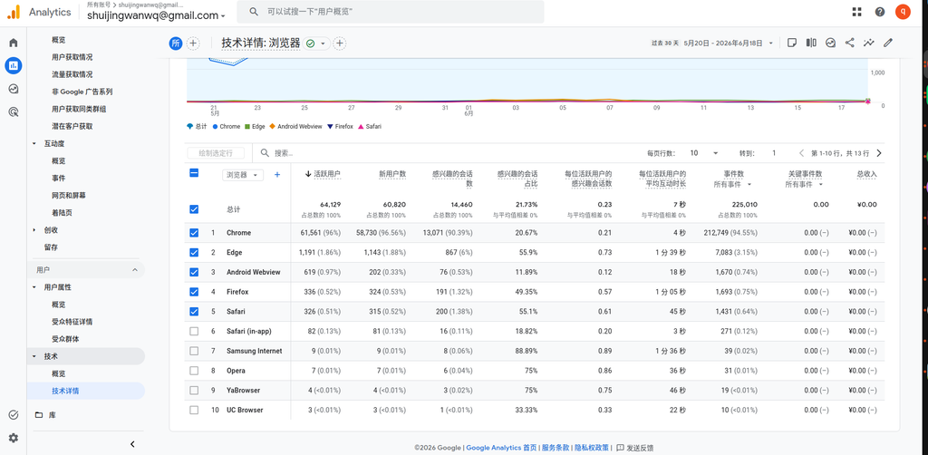
When I saw this data, I breathed a sigh of relief.
The thing that gave me the most headache to change the theme is compatibility – in case it’s messed up on Safari and collapsed on Firefox, how much time do I have to spend to fix it? As a result, my readers are almost all using Chrome, which means that my test range can be greatly reduced, and the risk is much lower.
To be honest, this data is an important promoter for me to shift from ‘hesitation’ to ‘decision to exchange’.
Operating system: more than 93% of Windows
One last look at the operating system version:
| operating system | Number of active users | proportion |
|---|---|---|
| Windows 10 | 37,230 | 58.05% |
| Windows 11 | 22,746 | 35.47% |
| Macintosh Intel 10.15 | 993 | 1.55% |
| android 12 | 486 | 0.76% |
| android 9 | 276 | 0.43% |
| Android 11.0 | 254 | 0.40% |
Windows 10 + Windows 11 total 93.52%.
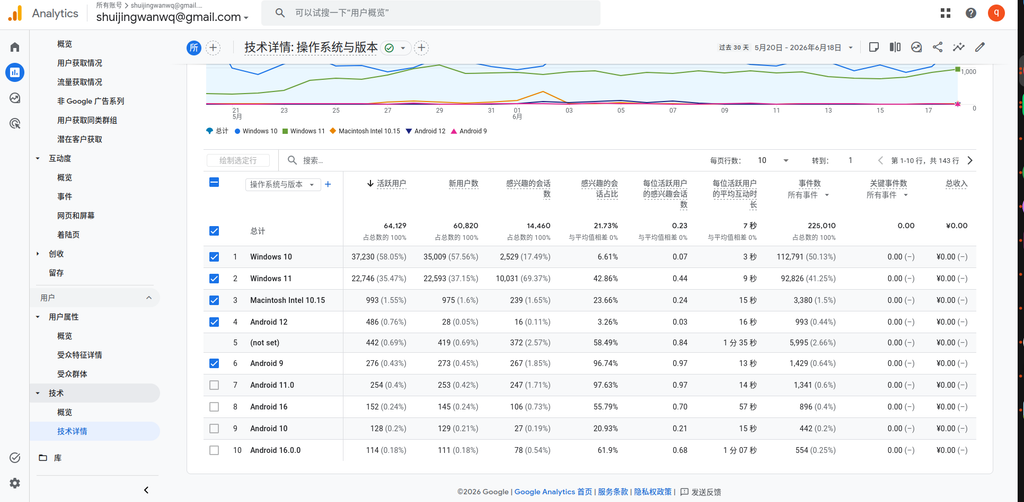
The user portrait is already very clear here:Desktop, Windows, Chrome browser, 1920×1080 or higher resolution– This is what most of my readers look like.
Putting the four sets of data together, I came to a judgment that made me feel at ease:
| dimension | Conclusion |
|---|---|
| Screen Resolution | 35%+ Active User Width > 1680px, experience damaged |
| Device Category | 96.36% desktop end, widescreen adaptation is just needed |
| browser | 96% Chrome, very low compatibility risk |
| operating system | 93.52% Windows, the test range is highly concentrated |
So my decision is: change
After struggling for several days, I finally decided to change it.
Not because hueman is not easy to use, nor because 1680px is completely useless, but becauseThe data tells me that my readers are already using a larger screen, and my theme is still limiting them with an outdated width.
The data makes me see one thing clearly: this decision seems to be ‘changing the theme or not’, but the essence isContinue to serve your past habits, or serve the real state of the reader. The answer is already obvious.
After deciding to change, a new question emerged:Change the theme and open the CDN, which one of these two things to do first? If the sequence is wrong, not only will the speed data be messed up, but it may also cause a cache disaster. I will leave this entanglement in the next article.
In the next article, I will talk about the decision-making process of ‘change the topic or open the CDN first’, and why the wrong order will bring a lot of trouble. Interested can continue to pay attention.
A little bit of emotion
To be honest, the process of making this decision made me feel very touched. Many times we are debating whether to do one thing or not, but it is actually not enough information. Once the data is spread out clearly, the answers often come to themselves.
If you are also debating whether to change the theme or not to change a function, you might as well look through your own data.Don’t guess, go check it out. The data will not be decided for you, but it will help you see the situation.
Leave a Reply