Practical records of self-use website construction, pure native block operation, no plug-ins, no code change, adaptation Twenty Twenty-Five Whole site FSE block theme, the default template: Text Blog Home, the site is equipped with Polylang bilingual plug-in.
Pre-renovation status
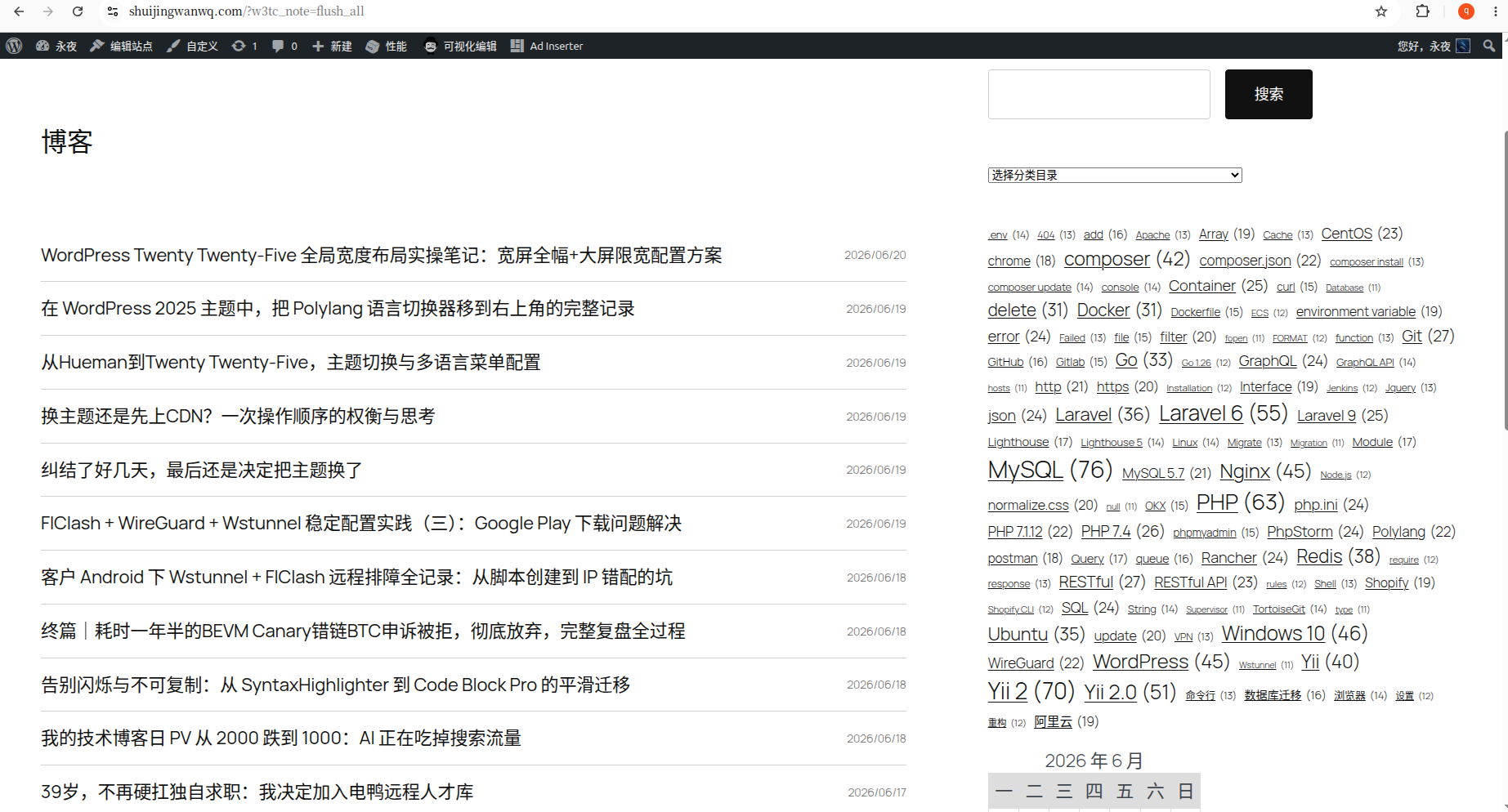
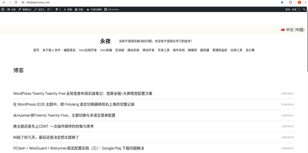
The theme comes with a TEXT Blog Home homepage template, the whole site defaultsSingle 1 column article list, there is no sidebar, and it is impossible to place classification, search, label, calendar navigation, which is not in line with the browsing habits of traditional technology blogs. (corresponding to Figure 1)
Personal practice sharing|The whole process of 7 steps of transformation (pure self-use review, novice can refer to)
step1: create a new column container
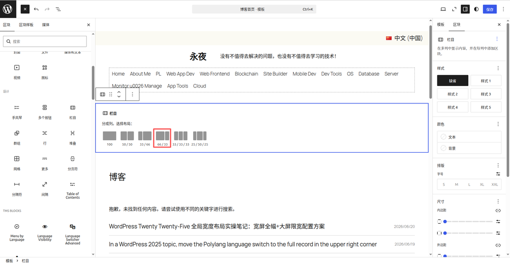
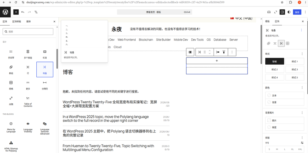
Go to the Site Editor → Edit the Text Blog Home homepage template, at the top blank, add the [Columns] block, and select the preset directly for the layout ratio:66 / 33
Reasons for selection: The optimal ratio of technical blogs, the reading width of the article on the left is sufficient, the right sidebar storage navigation tools, large screen beautiful, mobile phone automatic adaptive stacking. (corresponding to Figure 2)
step2: Migrate the main body of the original homepage article
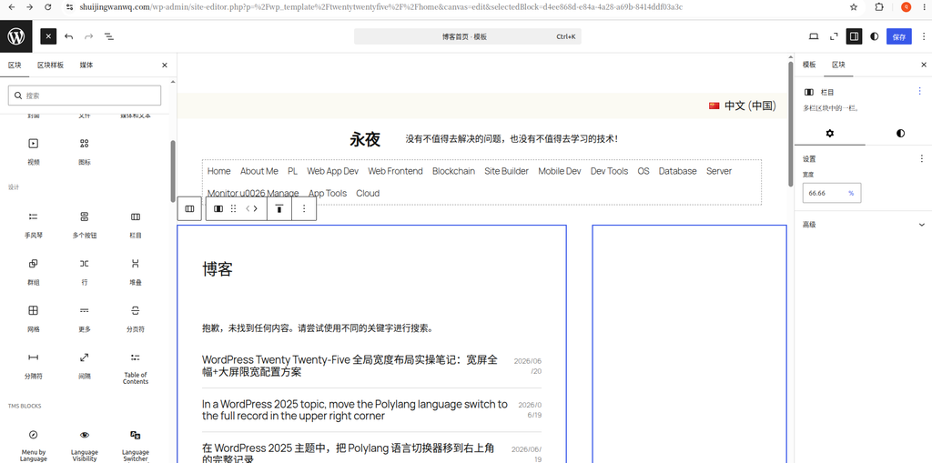
Find the [Group] block (including blog title, article list, and all content of paging) in the outer layer of the original single-column article, and directly drag and drop the whole 66% column container on the left inside.
⚠️Key points: Be sure to drag and drop the outer group, it is forbidden to drag and drop the list of articles alone, and avoid losing the title and paging components. (corresponding to Figure 3)
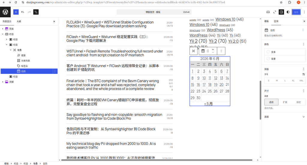
Step3: 33% column on the right, build a fixed container
Select the 33% blank column on the right, and add the [Stack] block inside.
The key point of the core pit avoidance (the biggest step on the pit this time):
- WordPress single column cells,Only 1 block can be placed at the top, direct addition of search/category will save after being invisible, the editor is invisible, and the outline can be seen
- It is forbidden to use rows (Row), and it is forbidden to directly stack blocks. It must be stacked as an outer universal container.
- The stacking has its own vertical spacing, which is suitable for the sidebars to be arranged up and down, without manually adjusting the margins (corresponding to Figure 4)
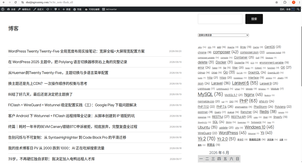
Step4: Inside the sidebar stack, add functional blocks in turn
Inside the stack container, add native blocks sequentially from top to bottom, without plugins:
- search form
- Article classification list
- tag cloud
- Calendar block
All built into the stack, the save block will not disappear and will not be hidden. (corresponding to Figure 5)
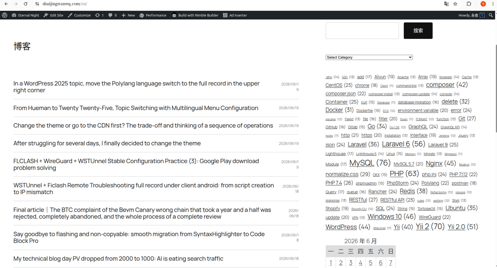
Step5: Retrofit completes bilingual front desk effect
This time, it is adapted to the Polylang bilingual site, the layout is globally synchronized, and there is no need to modify the template twice:
- Chinese (China) front page: 66 main content article + 33 standardized sidebar, the block is displayed normally (corresponding to Figure 6)
- ENGLISH English front desk homepage: the layout is completely consistent, the classification, label, and block are automatically adapted to the language, the layout is not messy, and the block is not lost (corresponding to Figure 7)
This transformation must see the precautions (solve 99% of block stealth and loss problems)
1. Block level iron rules (must abide by)
外层栏目66/33
├─左侧66% = 放入文章外层群组
└─右侧33% = 仅放1个堆叠Stack
   └─堆叠内部:放所有搜索/分类/标签/日历
It is strictly forbidden to put multiple independent blocks directly in column 33. After saving, the editor canvas is invisible, and only the outline can be seen.
2. Suggestions on the selection of column proportions
- ✅First choice: 66/33 (for technical blogs, recommended)
- ❌Unselected: 50/50, 33/66 (text/code reading width deformity)
- ❌ No selection: Three columns 33/33/33 (the personal blog is too crowded, and the code display experience is poor)
Personal step on the pit: the real reason for the stealth of the sidebar block (in-person encounter)
Personal operation failure: The canvas of the editing page cannot see the search and classification blocks, but in the outline list in the upper left corner, the block exists completely and is not lost.
The real incentive: it is not a CSS, plug-in conflict, it is my operation error-The classification list, search blocks, and stacked blocks are placed in parallel, and there is no embedded inside the stack.. The top layer of 33% of the columns has stacked and classified multiple blocks at the same time, the theme rendering is abnormal, and the canvas is directly invisible.
Solution: Delete the parallel independent blocks, move the search, classification, label, and calendar to all the inside of the stack, and immediately restore the visualization.
4. Polylang bilingual adaptation points
- The whole set of columns + stacking structure, only need to modify the template once, bilingual shared layout
- Classification list block, open block multi-language adaptation, automatically switch between Chinese and English classification
- Don’t fix the language ID for the block, avoid the block disappearing after language switching
5. Answers to blocks
- Column columns: do the left and right columns of the page (this time 66/33)
- Stacking stack: put multiple function blocks up and down the sidebar (required)
- Row: horizontal and side-by-side content, this transformationNot at all
Retrofit summary
Twenty-five The new version of the block theme, there is no one-click sidebar switch in the traditional background, and can only rely on [column + stacking] double-layer container to build a classic two-column.
The whole set of operations has zero code, no plug-in, and bilingual compatibility. After the transformation, it will return to the traditional blog browsing structure. Visitors can quickly search the classification and label content through the sidebar, and adapt to the use scenario of the technology blog.
Leave a Reply