
Preface
Twenty Twenty-Five (2025) is a block-based full-site editor theme, with two sets of global width control:content width,wide width, can realize the effect of ‘small screen full screen full screen full, high score large screen automatic center white’.
This article combines the actual measurement of my 1920×1080 Ubuntu 26.04 device to completely record the problem of solving the global width setting and header navigation width.
1. The default global width parameter of the theme (Figure 1)
TT25 comes with a set of conservative narrow-range parameters, which is suitable for traditional text blogs, and it is also the initial state of most people:
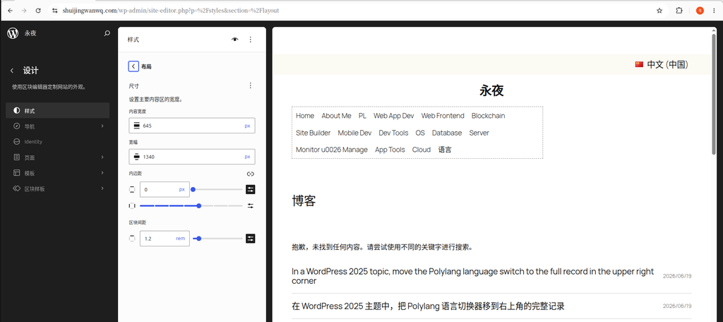
- Content width: 645px (argument text, normal paragraph standard width)
- Wide width: 1340px (large image, multi-column card, upper limit of wide-bar module)
- Root inner margin: up and down 0, left and right ordinary gears
The default configuration is short:
1920, 2K, and 4K large screens on both sides of the page are blank, and the horizontal space of the screen cannot be used, which is not in line with the current and future large-screen browsing trends.
2. Customize the global width customization settings for the future large screen (Figure 2)
My device: Ubuntu 26.04, monitor resolution 1920×1080
Adjustment goal: The small and medium-sized screen is fully covered, and the high-scoring large screen limits the maximum width, so as to avoid reading fatigue from too long text horizontally.
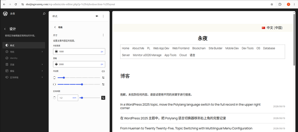
Final global parameter configuration
- Content width:
1800px(The upper limit of the text, ordinary text blocks) - Wide width:
2000px(Banner, header, multi-column card, upper limit of the big picture module) - Inner margin: the smallest up and down, the left and right ordinary
set entry
Background → Appearance → Editing → Design (Style Icon) → Layout panel, just fill in the value and save it directly.
Effect logic (simple understanding)
- Browser width < 1800px: the page is automatically filled in full screen, and there is no hard blank on both sides;
- Browser width 1800~2000px: the text is full of the screen, and the wide module is fully expanded;
- Browser width > 2000px (2K/4K ultra-wide screen): The maximum width of the content lock is automatically centered, and the blanks on both sides are optimized for reading.
3. The actual display effect of the front desk article page (Figure 3)
After modifying the global width and unified template alignment, the front desk article details page performance:
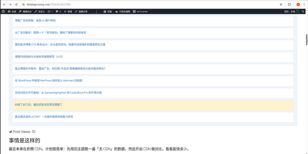
- Ordinary text paragraphs are subject to the width of 1800px content, and the widescreen is centered;
- Insert a wide-width alignment picture, table, and multi-column list to extend to the upper limit of 2000px;
- 1280. The visitor pages of narrow screens such as mobile phones are completely covered, and there will be no left and right blanks.
4. The problem of abnormal header navigation width: the navigation is limited by the width of the content (Figure 4)
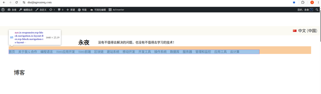
Test ideas
Directly modify the risk of the formal parameters of the whole station, first use small-size parameters for control test, and intuitively distinguish the two width boundaries:
Temporary test parameters: content width 1440px, width width 1680px
Visual distinction: The blue navigation block represents the 1440 content width, and the orange header outer container represents the 1680 width width.
problem
The header navigation is limited to 1440px, and there are a lot of blanks on both sides of the orange header. It is clearly set to 1680 wide, but the navigation cannot be covered with wide areas.
fundamental reason
- Header outer layer, navigation inner layer grouping defaultsEnable ‘Internal Block Use Content Width’, after this switch takes effect, all internal blocks are forced to shrink to ‘content width’, directly ignore the global wide size;
- Supplementary Note: This switch is not a global main switch, does not exist in the global style panel, only in the block setting panel of a single group/container.
5. Solution: Close the ‘internal block usage content width’ (Figure 5)
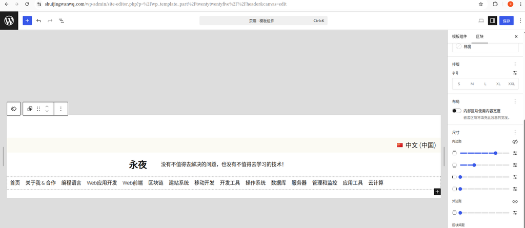
Operation steps (executed within the header template):
- Edit Site → Pull down the top template, switch to the header header template;
- Select the outermost layer of the header to group the orange root, and ‘block-layout’ on the right;
- Uncheck ‘Internal block usage content width’;
- Then select the blue navigation inner layer grouping of the package menu, and turn off the switch as well;
After all two-layer containers are closed, the mandatory limit of the width of the 1440px content will be released.
The final visual effect after turning off the switch (Figure 6)
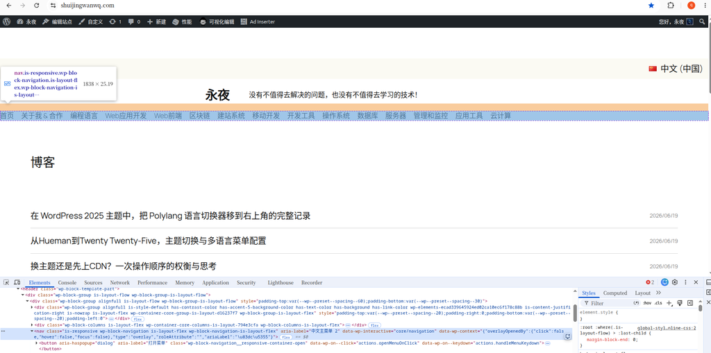
The two-layer grouping switch is all closed, and the page size changes:
- The width of the blue navigation block becomes 1838px, and the orange header container is synchronized with the same width;
- The navigation is completely covered with headers, and the orange white space on both sides disappears completely to achieve a wide-range full-frame visual effect;
Supplement
The editor canvas will ignore the global 2000px maximum width limit, and the preview value is too large; the front desk no trace window visits the website will strictly follow the global width upper limit, and the screen will be automatically centered and blank for over 2000px.
7. Summary of follow-up debugging
- Long-term formal parameters to maintain: content width 1800px, wide 2000px, suitable for future large-screen equipment;
- All pages, articles, archives, and search template outer layer groups are uniformly set full width width alignment;
- The header and footer two-layer grouping permanently closes the ‘internal block usage content width’ without repeated modification;
- In the future, you can replace the numerical tests of different widths by yourself. After the global parameters are modified, the synchronization of the whole station will take effect, and the header does not need to be adjusted twice.
Leave a Reply