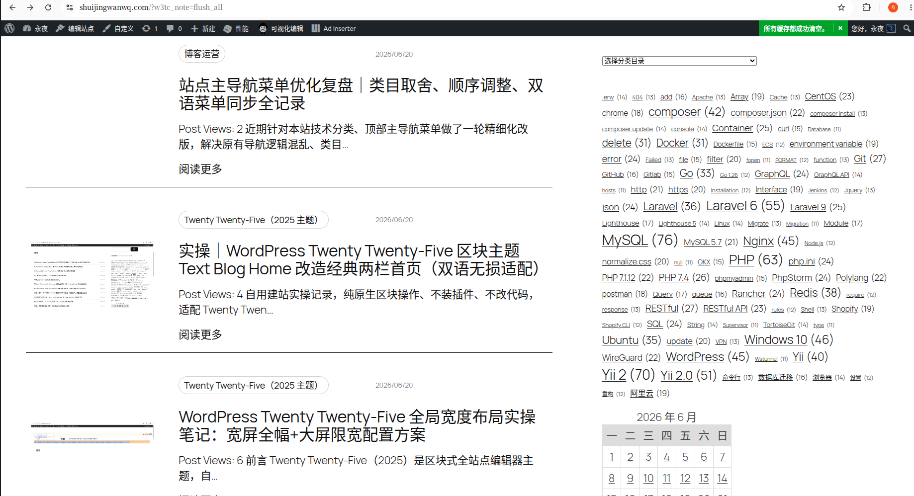
This site has just switched to the Twenty Twenty-Five theme, and is gradually improving the site page. The overall layout of the classic two-column text blog is adopted: 66% The main column of the article is matched with the 33% side tab bar.
There are obvious shortcomings in the original pure text title list, the page is left blank and the visual perception is monotonous; at the same time, a large number of historical articles on the site have not uploaded a feature cover image.
Compare the two sets of Query loops that come with the theme After presetting the template, the ‘Small Pictures and Title’ template is finally selected to reconstruct the article list, which not only fits the minimalism of the text to the technical blog, but also can Old articles that lack the cover, use the custom hierarchy of the native block throughout the whole process, and the bilingual site can be adapted without damage. The whole set of renovation processes is completely recorded below.
The status quo before the renovation
There are three core pain points in the default plain text list in the early stage of switching themes:
- 66% of the main column of the wide format only displays the title of the article, and there is a lack of auxiliary information such as classification, release time, and summary, and the large area of blank blank makes the page appear thin and hollow;
- The page has no clear visual layering, all articles are completely consistent in style, and the browsing lacks rhythm and place;
- The list is only piled up in plain text, lacking picture elements for visual buffering, and it is more boring when reading a lot of technical reviews.
The two-column frame of the overall page 66/33 remains unchanged, only for the middle Text Blog Query Loop The article loops the internal structure transformation.
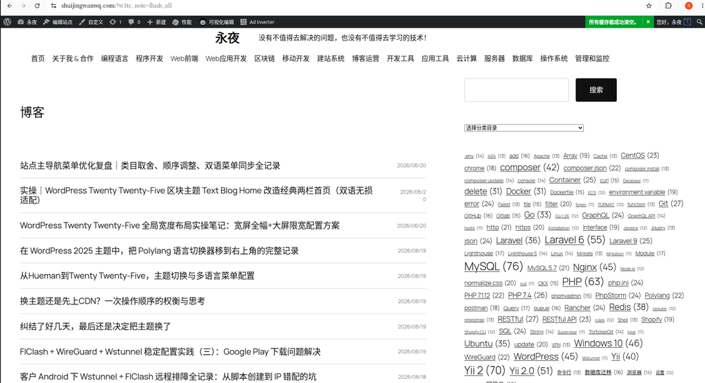
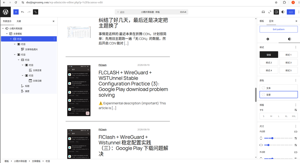
2. Step 1: Call the official preset template ‘Small Pictures and Titles’ (Figure 2)
Twenty Twenty-Five’s FSE Site Editor has a variety of ready-made Query Loop design templates, no need to manually build article templates from zero:
- Go to ‘Appearance → Editor’ in the background, and open the [Blog Homepage] template;
- Select the blue highlight in the list view on the left
Text Blog Query Loopquery loop block; - Click on the top toolbarChange design, and select ‘Small Pictures and Titles’ in the pop-up template preview library;
- After one-click application of the template, the system automatically generates a supporting article template, which comes with a narrow thumbnail on the left side, which is perfectly suitable for a large number of historical articles without cover.
Selection and selection description
Another option is the ‘Picture on the Left’ large graphic template, and finally give up the reason:
Hundreds of old articles in the station are not equipped with special covers, and the big picture template will leave a large blank space on the left side when there is no picture, and the visual separation is serious; the thumbnail area of the small picture template is narrow, even if there is no If there is a cover, it will only leave a slender white space, and the sense of violation is extremely low, and there is no need to configure additional conditions and styles to hide pictures. The later maintenance cost is lower, which is in line with the technical blog positioning of this site.
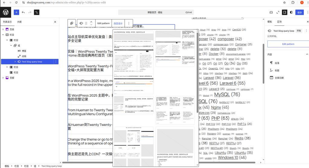
3. The initial preview effect of the template (Figure 3)
Initial display effect of the foreground after applying the template:
- Automatically generate small-sized feature thumbnails on the left, and only keep the title of the article on the right;
- Lack of auxiliary information such as classification, release time, and summary, and the problem of wide-pane monotony has not been improved;
- There is no dividing line, the spacing of blocks is compact, and the upper and lower articles are vague;
- The page structure is single, and there is no rich information level to support the visual fullness.
The initial template only completes the basic graphic and text structure, and needs to manually adjust and expand the internal block level to enrich the page information dimension.
4. Custom article template hierarchy structure
Enter the template editing interface, re-adjust the block order inside the [Article Template], and the final complete hierarchy is as follows:
文章模板(最外层父容器)
├─ 栏目(两栏50/50均分,顶部信息栏)
│  ├─ 左栏:分类目录区块(开启彩色圆角标签样式)
│  └─ 右栏:文章日期区块(浅灰色小字,靠右对齐)
├─ 文章标题(H3层级,可自定义字号,自主调整与摘要的间距)
└─ 文章摘要(次要灰色文字,可自行控制展示行数)
layered design ideas
- Top 50/50 points bar: Display the classification and date before the visit, the visitor can quickly obtain the article category and release time, and the readability of the information is improved in the front of the page.
- Title Independent Layer: As the core reading subject, the distance between the title and the upper and lower blocks can be freely adjusted according to its own aesthetics, and the visual distinction is made to the top meta information and the bottom abstract;
- Summary Supplements: Fill in the 66% wide blank blank, increase the thickness of the page text, relieve the sense of monotony, and help visitors quickly judge the core content of the article;
- Keep the small thumbnails of the native left side of the template natively, do not change the basic graphic structure, and reduce the probability of style conflicts.
5. Global fine-tuning of refined styles (key optimization points)
All dimensions and spacing parameters do not need to be copied, you can freely drag and adjust according to your own page aesthetics, only explain the adjustment direction:
- Top 50/50 column styles
- Category: Turn on the label mode, match the theme color rounded background, adjust the distance between the labels, and increase the page color embellishment;
- Article date: narrow the font size, the text is set to minor light gray and right-aligned, and the weight is weakened to avoid the visual center of grabbing the title;
- Self-adjust the outer margins at the bottom of the column and separate the titles below to avoid crowding and stacking of text.
- Text block spacing control
- Adjust the blank at the bottom of the title of the article as needed, and open the hierarchical distinction from the abstract;
- The abstract is unified in light gray, and the number of truncated lines is set by yourself, so as to avoid over-long texts that are overly high;
- Overall beautification of outer article template
- Adjust the outer margin of the bottom, reserve a comfortable blank for each article, and improve the sense of reading breathing;
- Add 1px light gray subdivision line at the bottom to clearly distinguish the upper and lower two articles;
- The container sets the upper and lower margins to prevent the content from sticking to the block border;
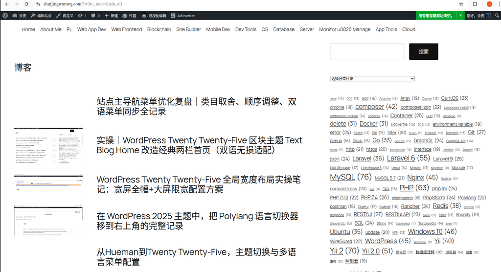
6. The final homepage effect of the transformation to complete the final homepage (Figure 5)

After all adjustments and saves, the final effect highlights of the front desk are:
- Perfectly compatible with no cover article: the small thumbnail on the left side is slender, will not split the page, and does not need to complete the cover of historical articles in batches;
- The information level is complete and clear: the classification label + the pre-disclosure of the release date, the title is eye-catching, the summary supplementary content, 66% wide fence is full or empty;
- Comfortable visual rhythm: dividing line + blank to distinguish independent entries, rich page layers, get rid of the sloping feeling;
- Bilingual zero dislocation: all original dynamic blocks of WordPress (category, date, title, abstract, featured pictures), the Polylang bilingual plug-in can automatically synchronize Chinese and English content, and do not need to maintain two sets of independent templates;
- Adhere to the minimal positioning of the text blog, do not stack redundant modules (review, author avatar, multi-picture slides, etc. are all abandoned, and focus on technical text reading experience).
Seven, the summary of the pit (bilingual FSE template transformation precautions)
- All spacing, color, and size can only be adjusted by using the settings panel on the right side of the original block, and do not write custom CSS, so as to avoid confusion in Chinese and English page styles;
- Do not insert static text or static pictures, use dynamic article blocks throughout the whole process to ensure that the corresponding language content is automatically read in the bilingual environment;
- When you want to replace the graphic template, repeat the selection
Text Blog Query Loop→ ‘Change Design’ to switch, the custom block hierarchy will be retained, no need to refactor all; - Archived pages and category pages can be transformed synchronously: open the archive template, find the query loop in the page, repeat this operation, and unify the display style of the entire site article list.
Postscript
This transformation did not change the original 66/33 classic two-column page frame, and only optimized the internal article loop list. Relying on the official preset template of the theme to reduce the cost of transformation, and then supplement the richness of the page through simple layered expansion, balance the ‘simplified text blog’ and ‘the page is full and not monotonous.’ ‘Two major needs, and at the same time, are suitable for a large number of historical articles without cover, which belong to the homepage optimization plan with low maintenance and high adaptation.
Leave a Reply