When I recently checked the WordPress single article page, I found that there are horizontal scroll bars on both the desktop and mobile.
Since I have encountered problems such as Gutenberg full-frame blocks, too long bread crumb titles, and abnormal archived page advertising containers, this time I thought it was caused by the block structure at first. However, after gradual investigation, it was finally confirmed that the horizontal scroll bar on the desktop is mainly from the middle advertisement of the AdSense article inserted by WPCode; horizontal overflow.
This article records the complete investigation process and final solution to CSS.
1. Problems
The problem appears on the WordPress single article page.
The desktop side is:
- The horizontal scroll bar appears at the bottom of the page;
- The page can be dragged left and right.
- The text, page header, and footer of the article are all slightly widened.
The mobile side is:
- Even after the desktop side is repaired, there are still horizontal scroll bars on the mobile terminal;
- The page horizontally is about 20px more;
- The naked eye is not necessarily obvious, but the mobile terminal can slide left and right.
2. The first investigation: detect overflow elements
First execute in the browser console:
const vw = document.documentElement.clientWidth;

[...document.querySelectorAll('*')]
  .filter(el => el.getBoundingClientRect().right > vw)
  .map(el => ({
    tag: el.tagName,
    class: el.className,
    width: Math.round(el.getBoundingClientRect().width)
  }))
In the initial results, it appears:
[
  {
    "tag": "DIV",
    "class": "",
    "width": 1200
  },
  {
    "tag": "IFRAME",
    "class": "",
    "width": 1200
  }
]
This means that there is a 1200px wide iframe in the page, and its outer layer div.
Because there are Google AdSense ads in the page, the first reaction is: it may be that the ad iframe has stretched the page width.
3. Continue to investigate iframe sources
Then execute:
[...document.querySelectorAll('iframe')]
  .filter(el => el.getBoundingClientRect().right > document.documentElement.clientWidth)
  .map(el => ({
    src: el.src,
    width: el.getAttribute('width'),
    styleWidth: el.style.width,
    rectWidth: Math.round(el.getBoundingClientRect().width),
    parentTag: el.parentElement?.tagName,
    parentClass: el.parentElement?.className
  }))
The result is an empty array:
[]
This means that the iframe itself is not a stable and continuous overflow element, it may be that the ad script has changed after the dynamic adjustment.
So continue to check the overall width of the page:
({
  clientWidth: document.documentElement.clientWidth,
  scrollWidth: document.documentElement.scrollWidth,
  bodyClientWidth: document.body.clientWidth,
  bodyScrollWidth: document.body.scrollWidth
})
The result of the desktop is similar:
{
  "clientWidth": 1518,
  "scrollWidth": 1959,
  "bodyClientWidth": 1518,
  "bodyScrollWidth": 1959
}
This means that the actual scroll width of the page has reached 1959px, which is 441px more than the viewport width of 1518px.
4. Misjudgment in the middle: It is suspected that the title of the bread crumbs is too long
After continuing the investigation, I found that there are bread crumbs navigation on the page:
首页
建站系统
博客系统
WordPress
Twenty Twenty-Five(2025 主题)
WordPress 归档页 AdSense 报错 availableWidth=0:从横向滚动条到 Gutenberg 区块结构的排查全过程
Since the title of the last-level article is relatively long, it was once suspected that the bread crumbs caused the horizontal scroll bar.
So try to add:
/* 面包屑过长时自动换行,避免撑出横向滚动条 */
.wp-block-breadcrumbs {
    max-width: 100%;
    min-width: 0;
    overflow-wrap: anywhere;
    word-break: break-word;
}

.wp-block-breadcrumbs * {
    min-width: 0;
}
But the problem still exists after adding.
This shows that bread crumbs are not the root cause, at least not the main root cause of this problem.
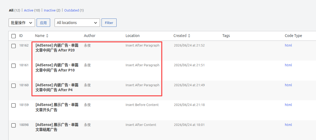
5. Final confirmation of the root cause of the desktop: the middle advertisement of the article inserted by wpcode
Then I disabled ad slots one by one in WPCode and finally found:
When the following 3 ad slots are disabled, the horizontal scroll bar on the desktop disappears:
[AdSense] 内嵌广告 - 单篇文章中间广告(第 4 段后)
[AdSense] 内嵌广告 - 单篇文章中间广告(第 10 段后)
[AdSense] 内嵌广告 - 单篇文章中间广告(第 20 段后)
This is basically confirmable:
The horizontal scroll bar on the desktop end is not caused by the theme itself, but the AdSense advertising container inserted in the middle of the text of the article has propped up the page.
6. Desktop solution CSS
Finally, add the following CSS to the AdSense in the body of a single article:
/* 限制单篇文章正文里的 AdSense 不撑出页面 */
.single .entry-content .adsbygoogle,
.single .entry-content ins.adsbygoogle,
.single .entry-content iframe {
    max-width: 100% !important;
    width: 100% !important;
    box-sizing: border-box;
}
The role of this CSS is:
- Limit the maximum width of the AdSense container in the body to not exceed the body area;
- The restriction of the iframe does not exceed the parent container;
- Use
box-sizing: border-boxAvoid Padding and Border to continue to broaden; - Use
!importantOverride some inline styles that are dynamically generated by AdSense.
After adding, the horizontal scroll bar on the desktop end disappears.
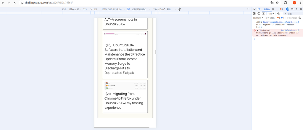
7. There are still horizontal scroll bars on the mobile terminal
Although the desktop side is fixed, there are still horizontal scroll bars on the mobile terminal.
Continue to execute on mobile:
({
clientWidth: document.documentElement.clientWidth,
scrollWidth: document.documentElement.scrollWidth,
diff: document.documentElement.scrollWidth - document.documentElement.clientWidth,
bodyClientWidth: document.body.clientWidth,
bodyScrollWidth: document.body.scrollWidth
})
get the result:
{
"clientWidth": 412,
"scrollWidth": 432,
"diff": 20,
"bodyClientWidth": 412,
"bodyScrollWidth": 432
}
This means that there are only 20px more mobile pages.
Continue to detect overflow elements:
const vw = document.documentElement.clientWidth;
[...document.querySelectorAll('*')]
.map(el => {
const r = el.getBoundingClientRect();
return {
tag: el.tagName,
class: String(el.className),
id: el.id,
width: Math.round(r.width),
left: Math.round(r.left),
right: Math.round(r.right),
text: (el.innerText || '').slice(0, 80)
};
})
.filter(x => x.right > vw + 1 || x.left < -1)
.sort((a, b) => b.right - a.right)
.slice(0, 30)
The result appears:
[
{
"tag": "DIV",
"id": "aswift_1_host",
"width": 412,
"left": 20,
"right": 432
},
{
"tag": "IFRAME",
"id": "aswift_1",
"width": 412,
"left": 20,
"right": 432
},
{
"tag": "DIV",
"id": "aswift_2_host",
"width": 412,
"left": 20,
"right": 432
}
]
This is relatively clear.
The mobile viewport width is 412px, and the dynamically generated iframe width of AdSense is also 412px, but it comes from left: 20px It starts, so there are more 20px on the right side.
That is, the mobile horizontal scroll bar is a slight offset from the AdSense dynamic iframe.
8. Why didn’t you continue to precisely repair the ASWIFT container?
In theory, it can continue to target:
div[id^="aswift_"][id$="_host"],
iframe[id^="aswift_"]
Do more precise limits.
However, AdSense’s iframe and container ID are dynamically generated and may change later. And ad scripts often resize and position again after the page is loaded.
Therefore, instead of over-repairing some dynamic IDs, it is better to do a more stable bottoming treatment on the mobile terminal.
Nine, the final mobile terminal CSS
Final use:
/* =========================================================
* 移动端横向滚动条兜底修复
* 原因:AdSense 动态 iframe 可能产生 20px 左右偏移
* 处理:移动端禁止页面横向溢出
* ========================================================= */
@media (max-width: 768px) {
html,
body {
max-width: 100%;
overflow-x: hidden;
}
.wp-site-blocks {
max-width: 100%;
overflow-x: clip;
}
}
There is no horizontal overflow directly hidden at all ends of the whole site, but only on the mobile terminal.
The reason is:
- The desktop has been solved by restricting the main text advertising container;
- Only AdSense dynamic iframe 20px overflow is left on the mobile terminal;
- The mobile user experience is preferred, and the page should not be allowed to swipe left and right;
overflow-x: hiddenIt is a bottom plan for the side effects of advertising scripts.
10. The final complete CSS
The final reserved CSS is as follows:
/* 限制单篇文章正文里的 AdSense 不撑出页面 */
.single .entry-content .adsbygoogle,
.single .entry-content ins.adsbygoogle,
.single .entry-content iframe {
    max-width: 100% !important;
    width: 100% !important;
    box-sizing: border-box;
}
/* =========================================================
 * 移动端横向滚动条兜底修复
 * 原因:AdSense 动态 iframe 可能产生 20px 左右偏移
 * 处理:移动端禁止页面横向溢出
 * ========================================================= */
@media (max-width: 768px) {
    html,
    body {
        max-width: 100%;
        overflow-x: hidden;
    }

    .wp-site-blocks {
        max-width: 100%;
        overflow-x: clip;
    }
}
11. The conclusion of this investigation
Several experiences this question gave me are:
First, when you see the horizontal scroll bar, don’t immediately doubt the theme.
In a WordPress site, ads, third-party iframes, and external scripts can all dynamically change the page width.
second,scrollwidth And clientwidth It is the key to judging horizontal overflow.
if only scrollwidth > clientwidth, which means that the page is indeed widened.
Third, AdSense may indeed have layout side effects on the mobile side.
In particular, responsive advertising, automatic advertisements, middle advertisements in the body, and anchored advertisements may all generate dynamic iframes, resulting in a slight overflow.
Fourth, the theme editor can only solve the structural problem, and cannot fully control the AdSense dynamic iframe.
If the Gutenberg block is full, group alignment, and breadcrumbs do not wrap, the theme editor can solve it.
However, if it is an iframe offset generated by the adSense runtime, it is often necessary to end up with additional CSS.
Fifth, advertising revenue and page experience need to be balanced.
Technical blog readers are more sensitive to the page experience. If the advertisement causes the page to scroll horizontally, the layout trembles, and the reading experience deteriorates, then even if the advertisement brings a little revenue, it may not be worth it.
12. Follow-up optimization direction
Follow-up can continue to observe:
- Whether to keep only the advertisements in the middle of the desktop article;
- Whether the mobile terminal reduces the middle advertisement of the text;
- Whether to close some automatic advertisements;
- Whether to keep only the advertisement at the top of the article and a small number of text ads;
- Whether to continue to manage ad slots with WPCode;
- Whether to add outer containers uniformly for each ad slot.
The ideal advertising strategy is:
The desktop can properly retain the middle advertisement of the text;
The mobile terminal minimizes the number of advertisements and gives priority to ensuring the reading experience.
After all, for technology blogs, user experience, page stability and long-term trust may be more important than short-term advertising revenue.
Technical Blog Growth & Monetization Consulting
I have been running my personal technology blog for more than 10 years and have published over 1,000 original articles covering WordPress optimization, multilingual websites, Google SEO, content strategy, and website monetization. All insights shared on this site come from real-world operation and long-term experimentation. If you are building a blog, developer website, SaaS project, or content-driven platform, I would be happy to share practical experience and optimization suggestions.
Ideal For:
✅ Technical bloggers
✅ Independent developers
✅ SaaS website owners
✅ Content creators seeking organic traffic growth
✅ Website owners interested in monetization opportunities
What I Offer:
✅ WordPress Performance Optimization
✅ SEO Consulting
✅ Multilingual Website Setup
✅ Ad Revenue Optimization
✅ Blog Growth & Monetization Consulting
If you would like to discuss your website, traffic growth strategy, or monetization opportunities, please contact me and mention: Blog Growth Consultation.
Contact Me:
Telegram: @shuijingwan
WeChat: 13980074657
Email: shuijingwanwq@gmail.com
Leave a Reply