

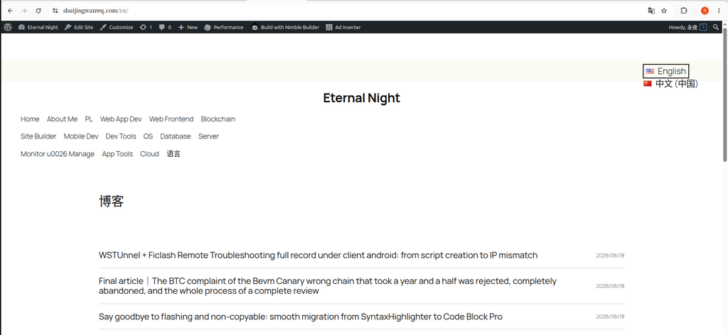
Recently, my tech blog has switched from the traditional Hueman theme to the official WordPress 2025 theme (Twenty Twenty-Five). This theme based on the modern block editor is very flexible, but when adapting the Chinese and English bilingual sites and customizing the footer, I still stepped on a lot of pits, and also accumulated some optimization experience. Today, I will organize the specific transformation process and share it with you.
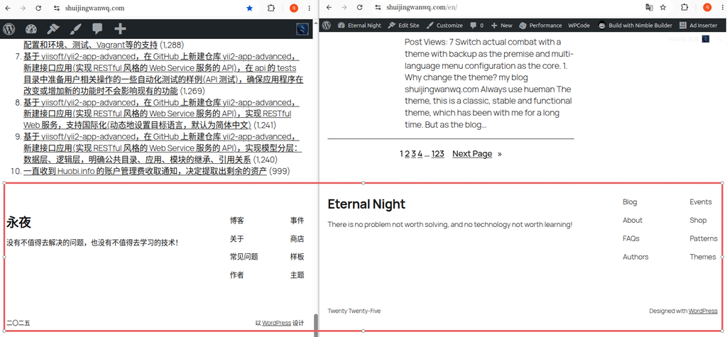
Step 1: Look at the footer of the original theme
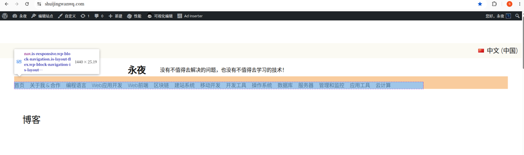
After switching to a new theme, the default footer is relatively ‘simple’, with many default placeholders and unrealistic links, which is very inconsistent with the tonality of the technical blog. There is also a problem that the content is not aligned in both Chinese and English versions.
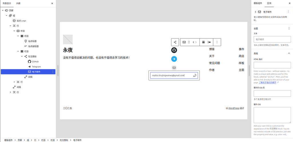
Step 2: Customize the social icon with the correct configuration jump link
WordPress based Social Icons For blocks, we can easily add icons such as GitHub, Telegram and so on.
There is one hereDetails that are particularly easy to step on the pit: When configuring an email icon,The link address must not be filled directly with the email addressand must use mailto: agreement.
The correct format is:mailto:shuijingwanwq@gmail.com. After filling in, the user can directly invoke the local mailbox client to send a letter by clicking the icon, and the experience is very good.
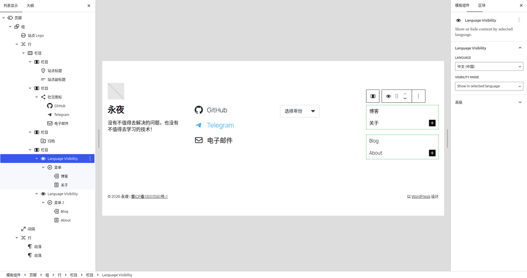
Step 3: Solve the differentiation of multilingual navigation menus
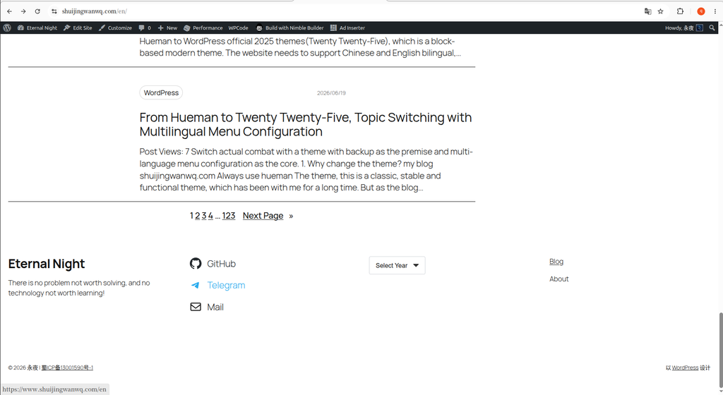
My blog uses the Polylang plugin to support both Chinese and English. In the Chinese state, the right side of the footer should display ‘Blog’ and ‘About’, and ‘Blog’ and ‘About’ should be displayed in the English state.
If you use a static menu block, the text under multiple languages will be confused. To solve this problem, I introduced Language Visibility block (Need to install TMS extensions for polylang plugin. The native Polylang plugin does not directly provide this block, and it can only be found in the editor using the FSE block theme after installing the extension).
I ended up building a 4 columns layout:
- Column 1: Brand Name and Slogan
- Column 2: GitHub, Telegram, Email social icons
- Column 3: Archive drop-down menu
- Column 4: Wrapped
Language Visibilitynavigation menu
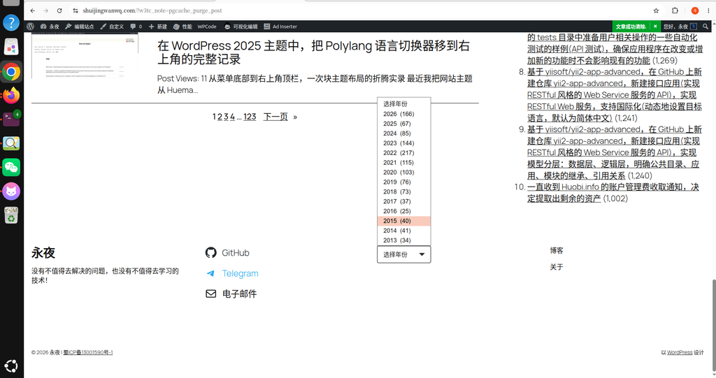
Step 4: A powerful tool to solve the pain points of technical blogs – archive drop-down menu
Tech blogs have more and more articles over time, if the archive list is displayed directly in the footer, like 2013 (34), 2014 (41)... Until 2026 (166) For more than ten years, it will be extremely lengthy, and the footer is very tall, resulting in too much white in the middle, which is extremely ugly.
My solution is to change the ‘archive’ todrop-down menu. WordPress natively provides this option. However, the style of the native drop menu is ugly (especially when using browsers such as Chrome and other browsers, it will show the native buttons, which is incompatible with the theme).
I completely beautified this drop-down menu by defining a CSS style.
Step 5: Apply CSS to beautify the drop-down menu
In the end, the footer in Chinese and English presents a very delicate drop-down frame, with its own black custom arrow, the frame is compact, and the width can be automatically adapted to the content.
🎁 Attachment: CSS core code for compatible classification and archives
If you have the same problem, you can copy the following code directly to the WordPress background Appearance -> Customize -> Extra CSS , the drop-down menu instantly becomes advanced:
/* ==========================================================================
   🔥 分类/归档 下拉菜单样式优化
   ========================================================================== */
/* 联合选择器,同时锁定分类下拉和归档下拉 */
.wp-block-categories-dropdown select.postform,
select[name="archive-dropdown"],
.wp-block-archives select {
    -webkit-appearance: none !important;
    -moz-appearance: none !important;
    appearance: none !important;
    background-color: #ffffff !important;
    border: 1px solid #d1d5db !important;
    border-radius: 4px !important;
    padding: 10px 44px 10px 16px !important;
    min-height: 46px !important;
    min-width: 120px !important;  /* 保证文字不拥挤 */
    width: fit-content !important; /* 自适应宽度,解决太宽的问题 */
    font-size: 16px !important;
    color: #1a1a1a !important;
    cursor: pointer !important;
    outline: none !important;
    /* 自定义黑色下拉箭头 SVG */
    background-image: url("data:image/svg+xml;charset=US-ASCII,%3Csvg%20xmlns%3D%22http%3A%2F%2Fwww.w3.org%2F2000%2Fsvg%22%20width%3D%22292.4%22%20height%3D%22292.4%22%3E%3Cpath%20fill%3D%22%23333333%22%20d%3D%22M287%2069.4a17.6%2017.6%200%200%200-13-5.4H18.4c-5%200-9.3%201.8-12.9%205.4A17.6%2017.6%200%200%200%200%2082.2c0%205%201.8%209.3%205.4%2012.9l128%20127.9c3.6%203.6%207.8%205.4%2012.8%205.4s9.2-1.8%2012.8-5.4L287%2095c3.5-3.5%205.4-7.8%205.4-12.8%200-5-1.9-9.2-5.5-12.8z%22%2F%3E%3C%2Fsvg%3E") !important;
    background-repeat: no-repeat !important;
    background-position: right 16px center !important;
    background-size: 14px !important;
}

/* 鼠标悬浮边框变色 */
.wp-block-categories-dropdown select.postform:hover,
select[name="archive-dropdown"]:hover,
.wp-block-archives select:hover {
    border-color: #000000 !important;
}After these few steps, my footer not only retains the brand sense of the blog, provides a clear social contact information, but also solves the pain points of multilingual navigation and archives. If you are also tossing about WordPress 2025 topics, I hope this record can provide you with some reference!
Leave a Reply