
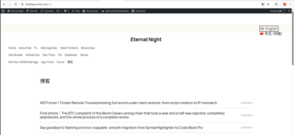
I believe that many WordPress webmasters will encounter a pain point of ‘inconspicuous but very affecting vision’ when building a blog—Default tag cloud block.
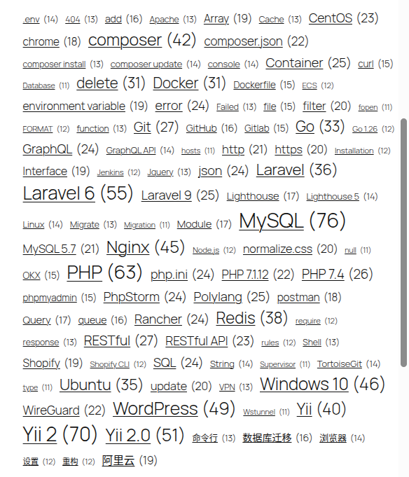
Recently, when I was optimizing the technical label of my site, I faced the embarrassing situation as shown in Figure 1: the length of the label is different, which leads to theThe right side is extremely uneven; There are also ugly underscores below; the overall lack of hierarchical relationships is like the original text directly taken out in the draft box.
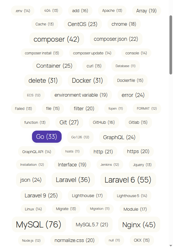
On the premise of not wanting to introduce a bloated plug-in, I tried to modify it with only native CSS, and finally achieved the modern and neat capsule label style of Figure 2. Today, I will share the optimization ideas and code.
1. Analysis of original pain points
Our commonly used WordPress Native Tag Cloud (under the 2025 theme), the default is streaming layout.
Because the number of words for each label is different, when they are folded and lined,Although the left side is perfectly aligned, there will always be jagged edges on the right side. Coupled with the lack of background color modification, the whole block looks very messy.
Second, the solution
In order to achieve the effect of Figure 2, I have set 4 core optimization points in the design:
- Solve the right side misalignment: give up streaming layout, use
flexboxLayout and force center alignment. - Go underscore, add capsule background: Remove the default link underscore, add a unified rounded background for each label, and make a ‘pill’ or ‘capsule’ style.
- Perfect vertical center: use
inline-flexMake sure the text is completely vertically centered within the capsule background. - Incorporate theme colors: No longer use the abrupt color, but directly call the benchmark color and emphasis color that comes with the 2025 theme.
3. Implementation of core CSS code
Click on the WordPress background in sequence Appearance -> Customize -> Extra CSS, the following code is pasted to take effect quickly:
/* ==========================================================================
   🔥 标签云(Tag Cloud)样式优化
   解决:原生标签云右侧边缘参差不齐、标签内文字未垂直居中、圆角生硬的问题。适配 2025 主题内建颜色变量。
   ========================================================================== */

/* 父容器:使用 Flex 居中解决右侧参差不齐 */
.wp-block-tag-cloud {
    display: flex;
    flex-wrap: wrap;
    justify-content: center; /* 核心:让所有标签在容器内居中排列 */
    gap: 10px 14px;          /* 标签之间的行间距和列间距 */
    padding: 10px 0;
}

/* 单个标签样式 */
.wp-block-tag-cloud a {
    /* 1. 解决背景内文本垂直居中问题 */
    display: inline-flex;
    align-items: center;
    justify-content: center;

    /* 2. 适当的圆角 */
    border-radius: 16px;

    /* 3. 采用 2025 主题自带的基准色和对比色 */
    background-color: #fbfaf3; /* 2025 主题浅米色背景 */
    color: #111111;            /* 2025 主题文字深色 */

    /* 基础布局 */
    padding: 6px 14px;
    text-decoration: none;     /* 去掉下划线 */
    font-family: inherit;
    transition: all 0.2s ease-in-out;
}

/* 鼠标悬浮效果:使用强调色搭配白色文字 */
.wp-block-tag-cloud a:hover {
    background-color: #503aa8; /* 2025 主题强调紫 */
    color: #ffffff;
    transform: translateY(-2px); /* 微微上浮增加交互感 */
    box-shadow: 0 4px 10px rgba(0, 0, 0, 0.08);
}Four effect evaluation
After applying the above code, the label cloud immediately makes a qualitative leap:
- visual core: All the labels are gathered in the center of the block, and the left and right layout is symmetrical and very harmonious;
- Enhanced breathing:
GAP: 10px 14pxleave sufficient gaps between labels; - Friendly interaction: The mouse is not only discolored, but also has a slight floating projection, which is no longer rigid.
- High weight is prominent: Since the native is preserved
font-sizeMechanisms with weight change, likemysql (76)This high-frequency word will naturally be larger visually and play a very good emphasis.
5. Reflections on the follow-up (or extended idea)
In fact, at the beginning, I would like to pursue the more extreme effect:Put the largest number of labels in the center, and the small number of them will spread out like petals.
However, after testing, it was found that this effect similar to 3D sphere or core divergence depends on CSS simply flex Arrangement cannot be done (css can only be in the middle of the entire row at present).
If you want to achieve that effect, you must introduce an external JavaScript library (such as jqcloud) and reconstruct the HTML structure.
Now that the existing CSS 2.0 beauty solution is good enough, I decided to ‘stop it in moderation’.
I even thought that if I have enough time in the future, I canDevelop an extremely lightweight tag cloud beautification plugin on WordPress. There is no need for complex interactions and 3D rotation, just do one thing:According to the main color of the user’s current theme, automatically generate this beautiful, centered, smooth hover feedback cloud. Concentrating on solving the UI pain points may be more valuable than making a panacean plug-in.
💡 Supplementary advice:
if you use it too 2025 The theme, directly copy the above code to take effect perfectly. If you are using other themes, you just need to replace the above code #fbfaf3,#503aa8 And #ffffff The color value at the place can be adjusted to your own theme style.
Leave a Reply