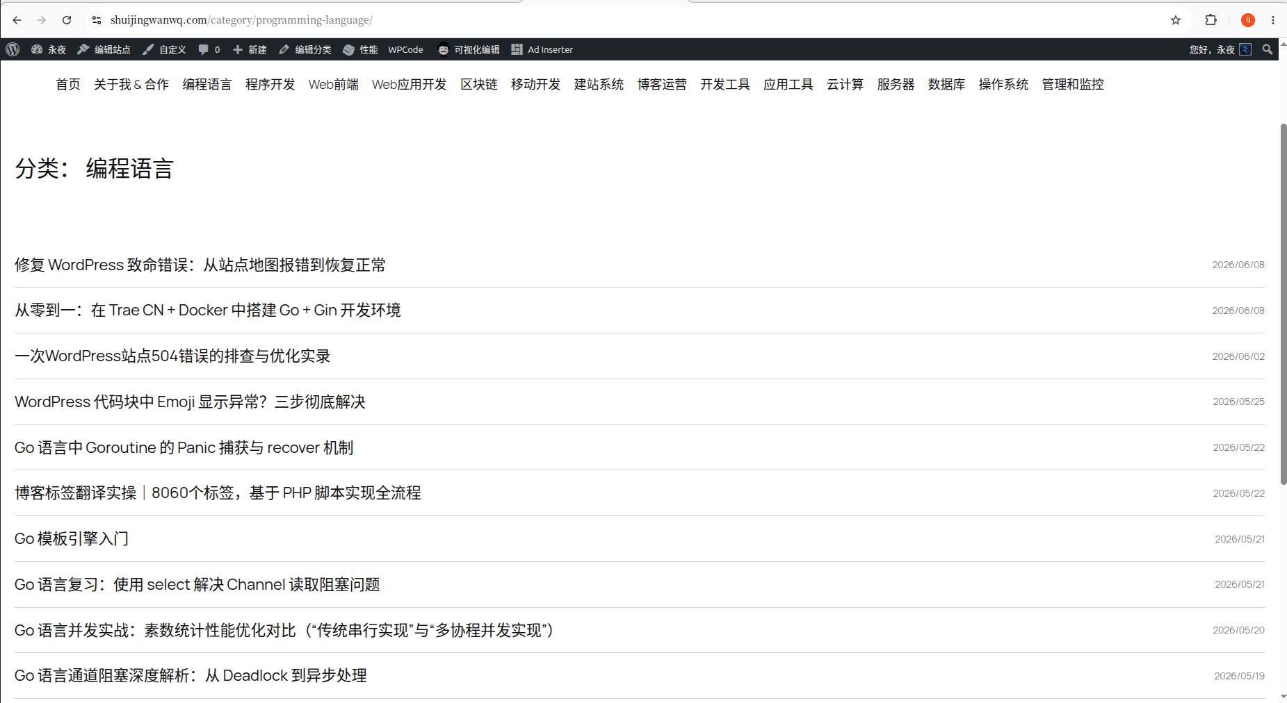

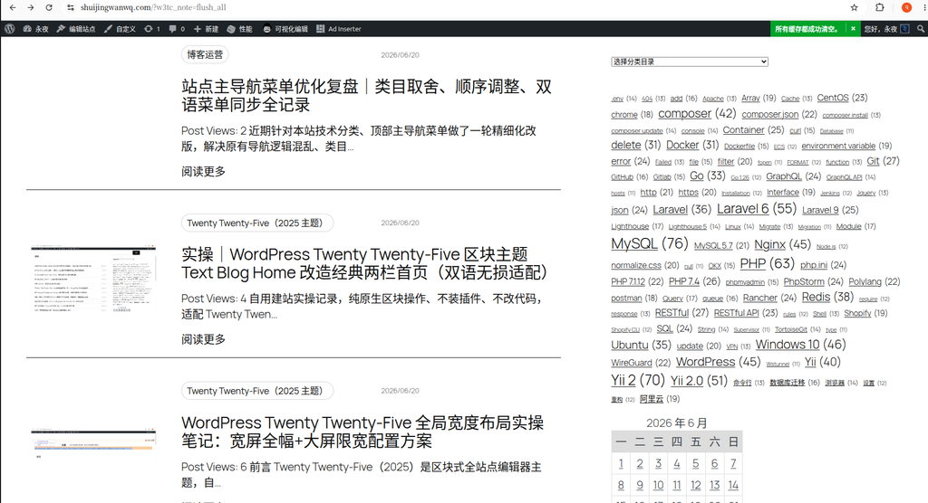
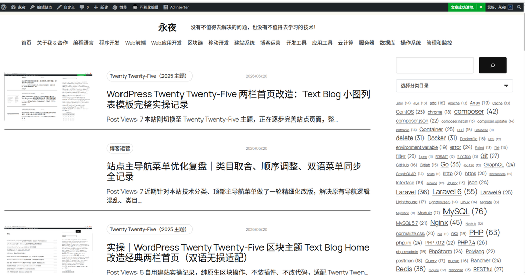
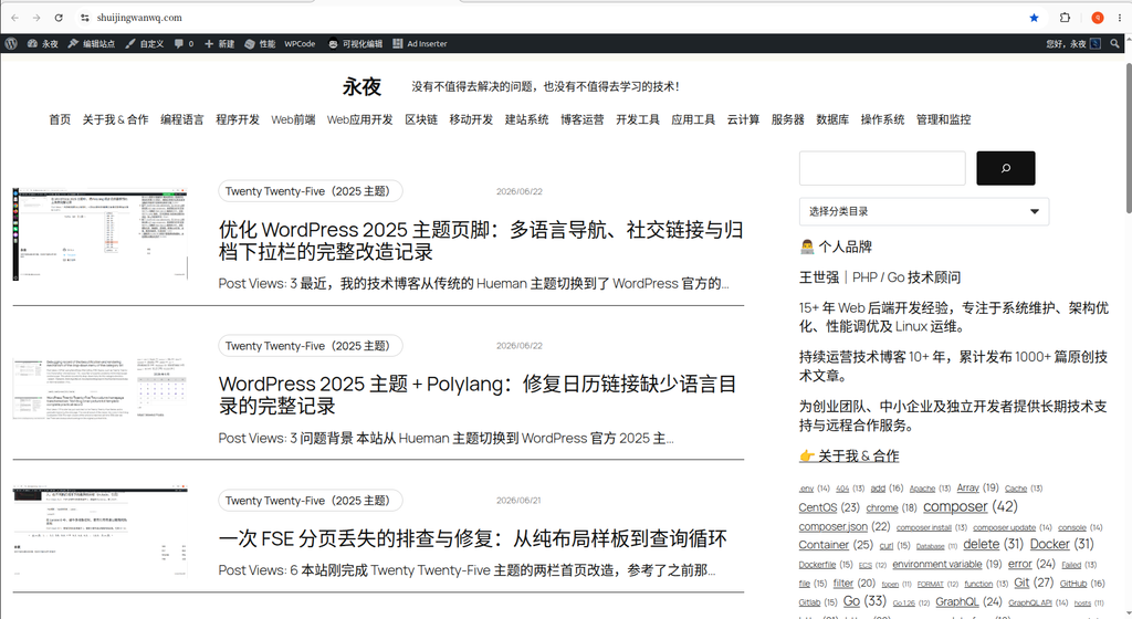
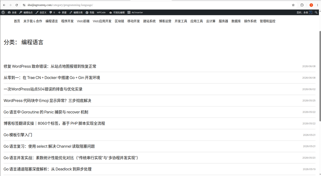
I recently encountered a small pain point while optimizing my technical blog. homepage of the website (shuijingwanwq.com) adopts the classic and information-rich left picture and right text + right sidebar structure (see Figure 1). But the classification pages (e.g. .../category/programming-language/) still retains the pure title list of the single column. Not only is there a missing sidebar on the right side, but there is no summary on the left list, which is very thin, and the visual effects on both sides are very inconsistent.
In order to unify the style, I decided to modify the template of the category page to the same as the home pageTwo-column layout, the right side is introduced to the sidebar, and the left side is raised by adding a summary. The following is the specific transformation process, focusing on the analysis of the block structure in the FSE editor.
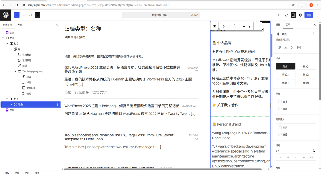
1. Copy the homepage sidebar structure
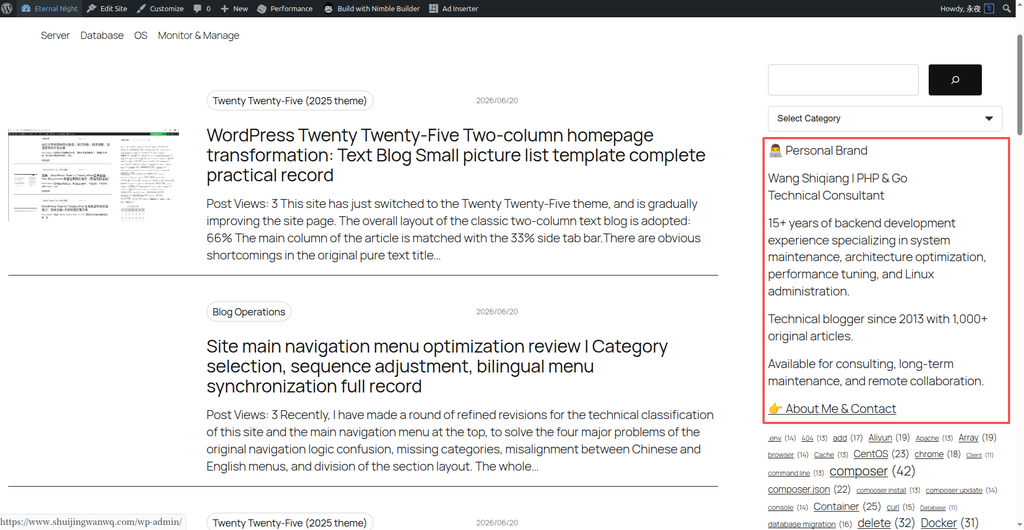
The first step is very fast. Use the ‘Edit Site’ function on the home page to enter the editor, and click any block in the sidebar on the right. Since my right sidebar is stacked with multiple blocks, I directly selected the functions that include search, category drop-down, personal profile, tag cloud and other functions. ‘Stack’ block. After selecting, press Ctrl + C copy.
2. Transform the classification page into two columns and paste the sidebar
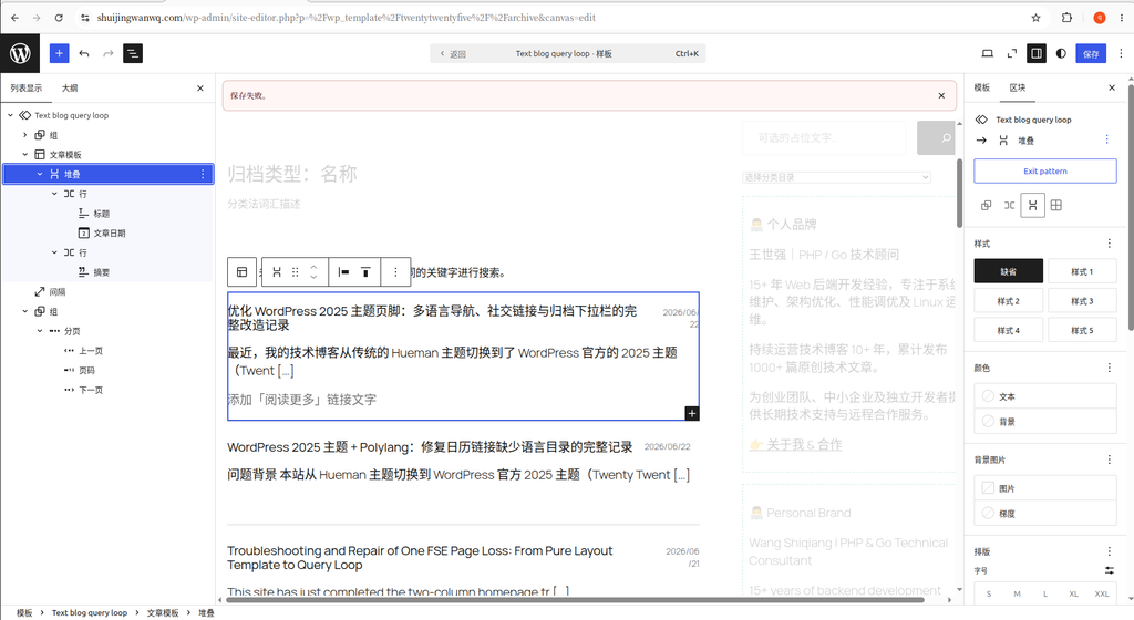
The second step is to exit the homepage editing, and enter the ‘All Archives’ template (this is a general template for archive pages such as categories, tags, etc.).
In the editor, I first changed the layout of the original single column toLeft and right columnsstructure. Then in the ‘Column’ that is vacant on the right, press ctrl + v Paste the sidebar you just copied.
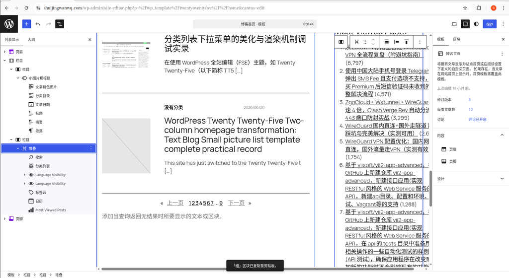
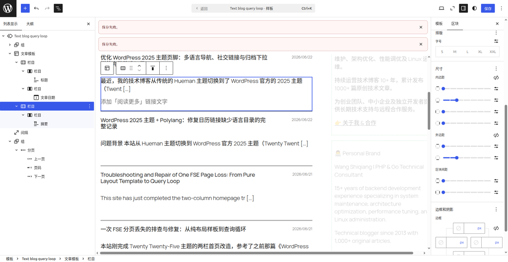
The basic editor block structure in Figure 4 is as follows:
- Main column on the left (content area):
Group(group)Archive title(Archive title)Project description(term description)Interval(Spacer)Text Blog Query Loop(Query loop block)
- right sidebar:
column(column)stack(stack) – [注:这是从首页直接复制过来的整个侧边栏区块,包含个人简介、标签云等]
3. Optimize the list height on the left and the excess blocks on the right
Through the transformation of Figure 4, the classification page has a sidebar, but because it is a pure title list, the height on the left side is too short, and the height of the sidebar on the right side is extremely mismatched.
Therefore, I unfolded the left side Text Blog Query Loop Middle Post Template, insideAdded ‘Excerpt’ block, let the content preview of each article stretch the height of the left. At the same time, go back to the right sidebar,Deleted the ‘Most Viewed Posts’ block that takes up a lot of height and is not needed.
At this time, the hierarchical structure of the blocks on the left and right sides is finally determined as follows:
- The main bar on the left (refinement into the structure of Figure 5):
Group(group)Archive titleProject descriptionIntervalText Blog Query LoopGroupPost Templatestack(stack)Row(Row): ContainsTitle (title),Post DateRow(Row): ContainsSummary (Post excerpt)—— [此次新增]
- right sidebar:
column(column)stack(stack) – [移除了 Most Viewed Posts 区块,高度缩减]
Preliminary effect and line breaking pain point
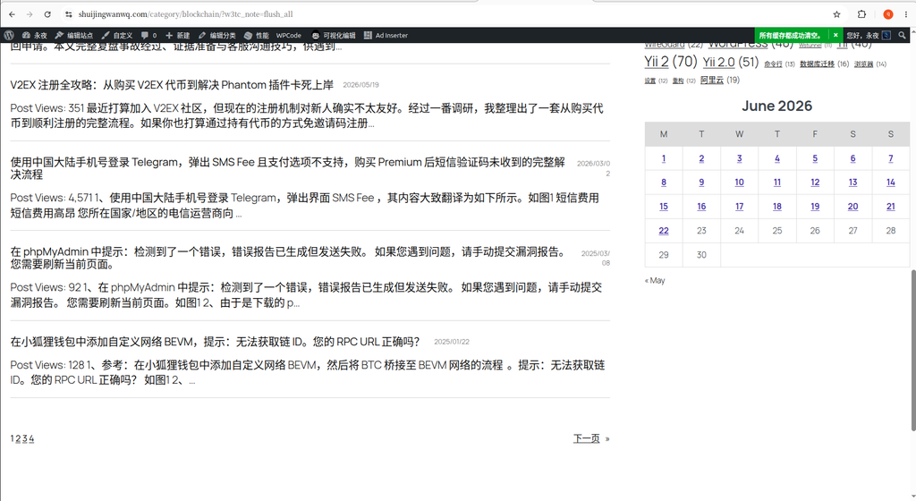
After the above modification, the number of display items of the blog category pages is still maintained in the 10 article.
- Chinese environmental test (Figure 6): The height of the list on the left is basically aligned with the height of the sidebar on the right.
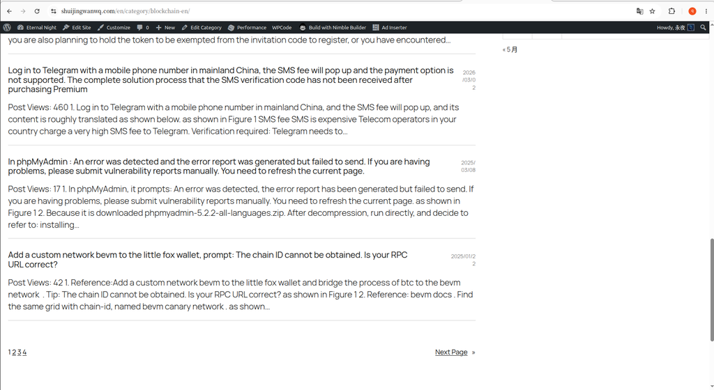
- English environment test (Figure 7): Due to the long English words, the left side is significantly higher than the right side (this problem is temporarily compromised and accepted).
- New pain points appear (Figure 8): I found that under the structure of ‘row’ nested ‘group (group)’, if the title of an article is longer, the right side of the
article dateIt will be squeezed into two lines for display, which will appear in Chinese and English environments, and the visual effect is very poor.
5. Ultimate optimization: directly use the ‘column’ to perfectly solve the date line break
In order to solve the date newline problem caused by the ‘row + group’ structure, I finally gave up the original nested structure, in Article Template Inside, directly replaced ‘Columns’ block. outermost stack Also removed, the structure becomes flatter and more stable.
The final editor block structure text in Figure 9 is as follows:
- Main column on the left (content area):
Group(group)Archive titleProject descriptionIntervalText Blog Query LoopGroupPost TemplateColumns—— [最终采用的方案,彻底取代了之前“堆叠+行”的嵌套结构]left column (column): containArticle Title (Post Title), the width is set to 85%, the block layout alignment is set to ‘Left Align’.Right Column (Column): containPost Date, the width is set to 15%, the block layout alignment is set to ‘Aligned right’.
Summary (Post excerpt)—— [放在栏目下方]
Remove the complex ‘stack’ of the outer layer, and use the underlying ‘column’ block directly under the article template, and give it to each 85% And 15% The fixed width ratio, this problem is easily solved. No matter how long the title is, the percentage space will automatically squeeze the title,The date that the right ratio is not squeezed will be squeezed againAt the same time, the perfect left and right alignment also makes the typesetting more standardized.
Figure 10 It is the final front-end display effect. Whether in Chinese or English environment, no matter how long the title on the left is, the release date on the right can be kept in one line safely, and the overall left and right height is perfectly aligned.
Summary:
In the WordPress block theme (FSE), through Ctrl+C And CTRL+V Copying the sidebar directly across templates is very efficient. If the list block of the classification page encounters the layout and squeeze problem,Upgrade from the ‘Row’ structure to ‘Columns’, with accurate percentage width allocation, it is often the ultimate solution. It not only solves the problem of alignment and line breaks in different languages, but also makes the layout of multilingual sites more stable and simple to maintain.
Leave a Reply