
In the previous article ‘Remember a WordPress 2025 Theme Logo and Favicon’s Tossing Journey’, I recorded myself from AI raw maps, PhotoPEA retouching, to finally letting the logo The entire process with the site icon (FAVICON) can be displayed normally.
Previous article:
Although it was basically available at the time, I still left a sentence at the end of the article:
In the later stage, I plan to optimize the site icons again, and there is still an obvious sense of squares. Due to time constraints, it was decided to suspend processing.
Unexpectedly, just two days later, I decided to completely solve this problem.
The problem still persists
The logo in the website header actually looks good.
The reason is simple:
- The display width of the header logo is only 120px left and right;
- The size of the picture itself is large;
- After the problem of the circular edge is reduced, it is not particularly obvious.
But the favicon in the browser tab is completely different.
Browsers usually only show:
- 16 × 16
- 32 × 32
such size.
Any tiny edge of variegated color will be enlarged to a visual effect after shrinking:
The entire circular icon looks like it is surrounded by a light gray square.
The picture below is the most obvious performance before optimization.
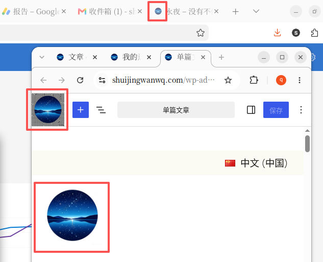
Especially at WordPress Site Editor In the background, since the background is light gray, this sense of square is more obvious.
At that time, although I was able to accept the display effect of the header logo, I was still not very satisfied with the site icon in the browser tab bar.
At first, I thought it was a problem with a transparent background
In the previous article, I always thought the problem came from:
- PNG is not really transparent;
- AI cut out is not clean;
- Photopea has not been completely deleted enough.
So, I checked the original image again.
It turns out that:
The real problem is not whether the PNG is transparent or not.
but:
Rounded edges still retain a large number of translucent (Anti-alias) pixels.
These pixels are almost invisible.
But after the browser scales the picture to 16×16:
All light gray edges are mixed together.
So what the browser tab sees is the ‘small square’ that has always made me dissatisfied.
Analyze with ChatGPT Plus
This time, instead of continuing to toss by myself, I directly sent the original PNG to the chatgpt plus.
In the beginning, we tried to analyze why transparent png still has a block feeling.
With constant analysis, I realized:
The real problem is not the transparent background, butTranslucent pixels remaining at the edge of the picture.
So, I let ChatGPT try to regenerate a logo that keeps the same style.
Throughout the process, we discussed:
- Why does the header logo look normal;
- Why does the browser tab bar appear squares?
- Why transparent PNG does not necessarily mean that the display effect is the best;
- Why Favicon requires much higher edge pixels than normal LOGO.
The whole analysis process gave me a new understanding of Favicon’s display principle, and it also made me realize that instead of constantly patching old pictures, it is better to directly generate a HD version with cleaner edges.
The LOGO that was regenerated by ChatGPT was finally used
In the end, I adopted ChatGPT Regenerated 1024 × 1024 png.
The new logo retains the original overall style, including:
- Starry sky
- Lake Reflection
- mountain silhouette
- blue gradient
The visual style is almost unchanged.
But since the edges are cleaner when regenerated, it is very suitable as a website logo and a favicon.
Then, I directly put this 1024 × 1024 PNG Upload to WordPress and reset:
Appearance → Editor → Site Identity
Also update:
- website logo
- Site Icon (Favicon)
Due to the higher resolution of the picture and the more natural edge processing, even if the browser automatically scales to:
- 32 × 32
- 16 × 16
The final display effect is still very ideal.
final result
After re-uploading the logo and clearing the browser cache, open it again:
- Browser tab
- WordPress background
- Site Editor
The overall effect has been significantly improved.
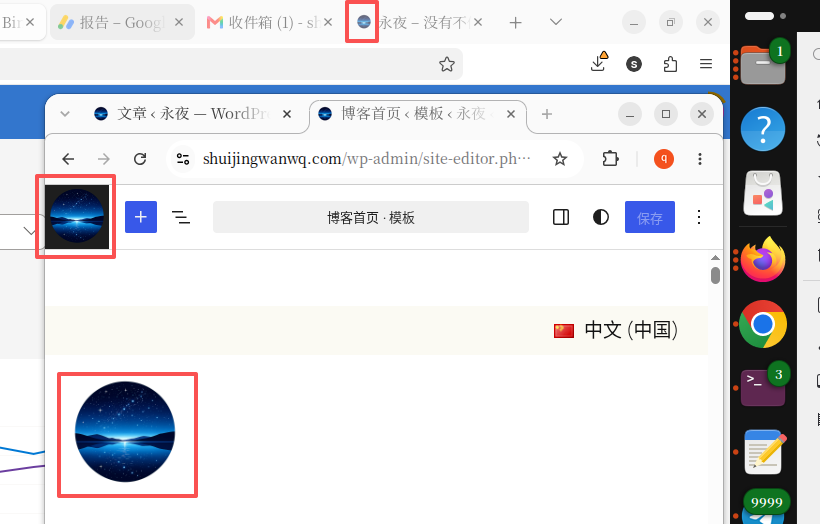
chrome:
- Header logo normal ✅
- The browser tab bar is normal ✅
Firefox:
- Header logo normal ✅
- Favicon finally has the obvious block feeling before ✅
Although if you put it in professional design software to observe pixel by pixel, you can still see a very small number of anti-aliasing pixels.
But for:
- Browser tab
- Favorites
- browser bookmarks
- Mobile desktop shortcut
For these real-world scenarios,
I have fully achieved the effect that I am satisfied with.
The biggest gain this time
I used to think that:
Transparent background = no problem.
Now I really understand:
What really affects the display effect of Favicon is not whether there is a transparent background, but whether the edge of the picture is clean enough.
Especially for:
16 × 16
This very small size.
A light gray edge of only 1 pixel wide is enough to make the whole icon look like a square.
There is also a new understanding:
In many cases, instead of constantly repairing a picture that already has a problem, it is better to regenerate a higher-quality source image.
For the LOGO generated by AI, this is often more efficient than a little editing in the later stage.
at the end
This time, this little problem was finally solved.
From the very beginning:
- AI generates the first version of LOGO
- Photopea manual retouching
- WordPress upload test
- Chrome vs Firefox
- Analyze the PNG edge problem again
- ChatGPT Plus Participate in Analysis
- ChatGPT regenerate 1024 × 1024 HD logo
- Change website logo and favicon
- Finally, completely solve the block feeling of the browser tab bar
Two articles tossed before and after.
Although it’s just a site icon of only a few dozen pixels, it makes me realize again:
Many seemingly inconspicuous details really affect the first impression of the entire website.
For long-term individual blogs, in addition to the content itself, these details are also worthy of serious polishing.
And this one thing that touched me the most was:
ChatGPT Plus can not only write code and write articles, but also become a good partner in some design details and problem analysis.
Technical Blog Growth & Monetization Consulting
I have been running my personal technology blog for more than 10 years and have published over 1,000 original articles covering WordPress optimization, multilingual websites, Google SEO, content strategy, and website monetization. All insights shared on this site come from real-world operation and long-term experimentation. If you are building a blog, developer website, SaaS project, or content-driven platform, I would be happy to share practical experience and optimization suggestions.
Ideal For:
✅ Technical bloggers
✅ Independent developers
✅ SaaS website owners
✅ Content creators seeking organic traffic growth
✅ Website owners interested in monetization opportunities
What I Offer:
✅ WordPress Performance Optimization
✅ SEO Consulting
✅ Multilingual Website Setup
✅ Ad Revenue Optimization
✅ Blog Growth & Monetization Consulting
If you would like to discuss your website, traffic growth strategy, or monetization opportunities, please contact me and mention: Blog Growth Consultation.
Contact Me:
Telegram: @shuijingwan
WeChat: 13980074657
Email: shuijingwanwq@gmail.com
Leave a Reply